Hi,
What do you think about this one?
Logo & Branding for innovative startup called QwikSense
- Contest holder: Rino001
- Category: Logo & stationery
- Status: Ended
Start date: 22-01-2013
Ending date: 22-02-2013
It all started with an idea...
A short, interactive guide helped them discover their design style and clearly captured what they needed.
Brandsupply is a platform where creative professionals and businesses collaborate on unique projects and designs.
Clients looking for a new logo or brand identity describe what they need. Designers can then participate in the project via Brandsupply by submitting one or more designs. In the end, the client chooses the design they like best.
Costs vary depending on the type of project — from €169 for a business or project name to €539 for a complete website. The client decides how much they want to pay for the entire project.
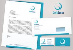
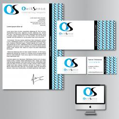
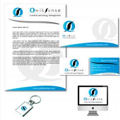
This one is to much. My focus goes to the right side of the paper. That's confusing because the focus has to be on the logo and the text of the letter.
Maybe you can explain your choice?
My choice was just aesthetic and for a no ordinary corporate identity... But if you don't like it, I will work on something different.
I like the way you think, a no ordinary corparate indentity is exactly what we are looking for. Only this design is not it.
Hope to see another design form you.
Here it is. It was longer because I had to find the right place for the S and change the shape of it.
I agree. the first one with the S inside is better. But personally I prefer the one with the S beside. I will see what I can do for a different design.
Thank you
Thanks again! This design does not meet our expectations. If we place the S inside the first one is better. And the second with de S outside the Q is also nice.
Maybe you have more inspiration for a totally other design?
Thanks a lot
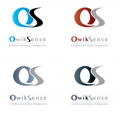
Another logo with the letter S more rounded and beside. Different colors too.
Can you put the S inside of the Q, like the first logo? Then i can see the difference. Thnx
No comments
Hi Stephen,
Is it possible to make this branding more trendy and with the logo were the S is beside the Q?
I am curious how it would look like.
Thanks!
Ciao,
Rino
Ok no problem. What is you favorite color combination for the logo and branding?
The light blue one.
If you make it more trendy can you make two designs? one with the S inside the Q and one with the S beside the Q.
Thanks
Hi,
This is my proposal for your new corporate identity.
I am waiting for your feedback
Sincerely
Stephen
Hi Stephen,
Thanks for your designs. It looks really great.
Is it possible to make the designs in different colors?
further i have some feedback points:
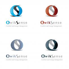
- Can you make the "S" more rounded so that it looks more like a real "S". But don't delete this design, so we can compare the two different designs.
- The logo color is now faded from grey to black, can you make it one color? The light grey you used know
- In the second image there is a watermark behind the logo can you make a new image without the watermark? In all the other designs you can leave it the way it is.
Greets,
Rino
Hi Rino,
Thank you very much for the feedback. I am glad you like my logo.
Just on thing, I don't understand what you mean in the second point on your feedback. About grey to black ...
I will give you soon another design with different colors, and one with a different letter "S".
The NSE at the end of QwikSense have a darker grey color then the WIK part.
Oh ok, It is normal because I made a graduate effect. I will change that if you want to.No problem
yes please.
 Nederland
 België
 France
 Deutschland
 Österreich
 United Kingdom
