Needs
General information
The Tennisclub Blau-Weiß Meckenheim-Tomburg e.V. is the oldest and largest tennis club in Meckenheim. A Club with a long tradition, but also the strong will to modernize.
Founded in 1955, it now has modern tennis club facilities with with 15 courts and a own club restaurant. 450 enthusiastic members are taking part in their tennissport in over 30 teams.
Competition / Invitation Brandsupply
Like almost all clubs nowadays, the Tennisclub Meckenheim also faces the challenge of declining membership rates at relatively fixed costs. At the center of our efforts is therefore the acquisition of new members.
This requires a new corporate design and a completely redesigned, modern appearance. Only by reorienting and professionalising in these areas and building a strong brand can the goal of new members be secured.
That is why today we are looking for support in this area.
Logo
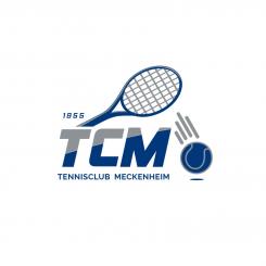
The previous logo is attached for orientation. The aim of the competition is the further development (modernization) of the existing logo or the complete new development (reinterpretation) of the logo.
If necessary, the new logo can also consist of word and image marks and e.g. the founding year 1955.
The Tennisclub is abbreviated as TCM (Tennisclub Meckenheim) or TCBWM (Tennisclub Blau-Weiß Meckenheim). The club motto is "friendly, familiar, fair"
The further developed or new logo should be fresh, appealing, modern and dynamic.
Color Scheme
The association colors are currently:
Blue (CMYK: 100/90/0/10, RAL 5002, RGB: 0/56/123)
White (CMYK: 0/0/5/0, RAL 9010, RGB: 241,236,225)
Gray (CMYK: 5/0/0/45, RAL 7045, RGB: 141/146/149)
Silver (CMYK: 0/0/5/0, RAL 9016, RGB: 241,240,234)
The new or further developed logo is to be based on the basic colors (blue and white). If desired, the logo should be expandable by means of additional colors (color scheme in yellow, orange, red, green and blue) and the possibilities for further topics such as team sports, youth, broad sport, leisure, sociallife, etc. in their differentiation.
However, we are also open to new, fresh, modern, color schemes in the area of blue to white (for example, beige, turquoise, etc.) and look forward to the ideas of the designers.
 Nederland
 België
 France
 Deutschland
 Österreich
 United Kingdom
