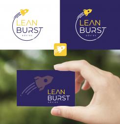
Total different idea with the L and the B. Kind regards.
Logo for a new consulting company
- Contest holder: isiscastells
- Category: Logo & stationery
- Status: Ended
Start date: 29-03-2022
Ending date: 05-04-2022
It all started with an idea...
A short, interactive guide helped them discover their design style and clearly captured what they needed.
Brandsupply is a platform where creative professionals and businesses collaborate on unique projects and designs.
Clients looking for a new logo or brand identity describe what they need. Designers can then participate in the project via Brandsupply by submitting one or more designs. In the end, the client chooses the design they like best.
Costs vary depending on the type of project — from €169 for a business or project name to €539 for a complete website. The client decides how much they want to pay for the entire project.
Is this what you mean?
Can the rocked shape by more elegant/simple?
Do you have a link of a picture of what kind of rocked you like?
https://www.brandsupply.nl/logo_huisstijl/logo-voor-een-nieuw-adviesbureau/162410/ontwerp/1291235
The rocked fits better in the letter U with straight sides like this
Please let me know if you prefer the first rocked, than I'll change it back.
Thank you, please let me know why the 4 star rating changed into a 3 star rating? Would you like to see any changes? Kind regards
Is because I'm comparing with other proposals and ranking. Maybe a different font type? Maybe you can play with the color of the letters and do the A and U in yellow and rest grey?
Is because I'm comparing with other proposals and ranking. Maybe a different font type? Maybe you can play with the color of the letters and do the A and U in yellow and rest grey?
Can you please give feedback how to improve the design? Thank you
Oh Haha you allready did
Bedoelt u zo? Groetjes
I miss the burst in the rocked of the center and in the card
I see, I'm also changing a bit in the 'U' so the rocket will fit just a bit more perfectly. Just a moment please :-)
No comments
I like the icon with the A and the U, maybe the typography a bit more modern, removing a bit in the E and the B and the color more towards to yellow
Gewoon Nederlands hoor :-) Dank je wel, ga ik direct doen!
Groetjes Yvonne
 Nederland
 België
 France
 Deutschland
 Österreich
 United Kingdom
