No comments
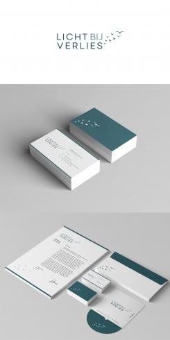
Logo for my therapy practice LICHT BIJ VERLIES Light at loss
- Contest holder: ArnievanVegchel
- Category: Logo & stationery
- Status: Ended
- Files: File 1
Start date: 01-10-2019
Ending date: 08-10-2019
It all started with an idea...
A short, interactive guide helped them discover their design style and clearly captured what they needed.
Brandsupply is a platform where creative professionals and businesses collaborate on unique projects and designs.
Clients looking for a new logo or brand identity describe what they need. Designers can then participate in the project via Brandsupply by submitting one or more designs. In the end, the client chooses the design they like best.
Costs vary depending on the type of project — from €169 for a business or project name to €539 for a complete website. The client decides how much they want to pay for the entire project.
hello
here's the logo with gold on birds :)
regards
philart
Now I see this, I like it better in the other design.
Which is one of my favorits! Thank you, Philart
my other design
Very nice! Refined and tasteful. I like it very much.
But I like the fond of the other designs better (in particular the 'ij' of 'bij').
Also, I would like to see some gold colour added (maybe only the birds?).
But yes; this is one of my favorits now! :)
No comments
Hallo Philart,
Bedankt voor het prachtige logo! Mooi symbool, mooi lettertype. Super stijlvol.
Enige kanttekening is dat het symbool niet meteen verlies uitbeeldt. En ik zou wellicht 'licht' nog dikgedrukt willen zien om daar de nadruk op te leggen...
 Nederland
 België
 France
 Deutschland
 Österreich
 United Kingdom
