Hey Richard, here are a few color variations
Logo for new holding company in industrial cables and cable assemblies
- Contest holder: Richard L.
- Category: Logo & stationery
- Status: Ended
- Files: File 1, File 2
Start date: 16-05-2019
Ending date: 05-07-2019
It all started with an idea...
A short, interactive guide helped them discover their design style and clearly captured what they needed.
Brandsupply is a platform where creative professionals and businesses collaborate on unique projects and designs.
Clients looking for a new logo or brand identity describe what they need. Designers can then participate in the project via Brandsupply by submitting one or more designs. In the end, the client chooses the design they like best.
Costs vary depending on the type of project — from €169 for a business or project name to €539 for a complete website. The client decides how much they want to pay for the entire project.
Promotion material
Hi, thanks!Can you make the same in another coloursetting? Thanks, Richard
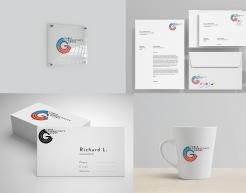
A collage of some mockups of the logo on different surfaces and items.
Brand Hierarchy
the concept is simple and based on having CCG as a host "ring" for the other companies, I used sample logos inside the rings, but I think you get the idea. The version on the left would be the one to use when its about showing one company and the one on the right could be used in footers or banners and could expand accordingly.
The colored arch in the circle could be used to color code different the different types of companies (engineering, installers, etc..)
Hello Richard,
here is my proposal for the logo, the colored one is the main version, the concept is based on the CCG name.
I will upload more files that show how the logo can be responsive to include brand hierarchy. I will also upload some mockups.
cheers,
Mohammad Masad
 Nederland
 België
 France
 Deutschland
 Österreich
 United Kingdom
