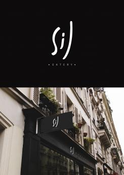
Hi again,
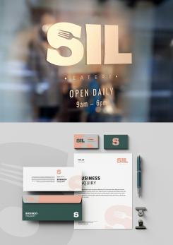
These are some mockup samples of the logo implementation on window signage and business stationeries.
Regards,
Robby
Logo for new restaurant
- Contest holder: silkenoet
- Category: Logo & stationery
- Status: Ended
Start date: 17-05-2020
Ending date: 07-06-2020
It all started with an idea...
A short, interactive guide helped them discover their design style and clearly captured what they needed.
Brandsupply is a platform where creative professionals and businesses collaborate on unique projects and designs.
Clients looking for a new logo or brand identity describe what they need. Designers can then participate in the project via Brandsupply by submitting one or more designs. In the end, the client chooses the design they like best.
Costs vary depending on the type of project — from €169 for a business or project name to €539 for a complete website. The client decides how much they want to pay for the entire project.
Hello :)
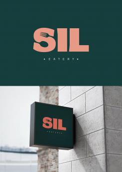
This logo concept is a simple, solid and straight to the point. The letter S combined with spoon and fork to represent the business while at the same time can be used as a standalone logo icon for stationeries and branding. The image of the logo is rather mature yet still fun, modern and classy.
Hope you like it :) Feel free for further discussion and adjustments.
Regards,
Robby
Hi again,
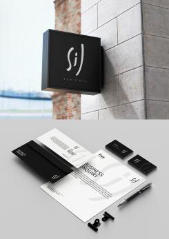
These are some mockup samples of the logo implementation on signage and business stationeries.
Regards,
Robby
Hello :)
The concept of the logo is to emphasize its simplicity and modern look yet still gives a warm and friendly impression. The simple stroke of handwriting of 'SIL' can also be seen as a happy-smiley face, suggesting the good times people will have at the nice restaurant that provide good foods and drinks. It also represents a personal touch that differentiate SIL from other restaurants.
The simplicity and contrast will help alot in terms of readibility and production. The word "eatery" can be replaced by "restaurant", "resto" etc.
Hope the logo suits your liking and need :)
We can discuss further adjustments on details of the logo. Please be sure to zoom in to see the implementation samples of the logo.
Regards,
Robby
 Nederland
 België
 France
 Deutschland
 Österreich
 United Kingdom
