No comments
Logo for the training and coaching company ConRetho Consult
- Contest holder: conretho
- Category: Logo & stationery
- Status: Ended
Start date: 13-02-2015
Ending date: 27-02-2015
It all started with an idea...
A short, interactive guide helped them discover their design style and clearly captured what they needed.
Brandsupply is a platform where creative professionals and businesses collaborate on unique projects and designs.
Clients looking for a new logo or brand identity describe what they need. Designers can then participate in the project via Brandsupply by submitting one or more designs. In the end, the client chooses the design they like best.
Costs vary depending on the type of project — from €169 for a business or project name to €539 for a complete website. The client decides how much they want to pay for the entire project.
Hello Jennifer,
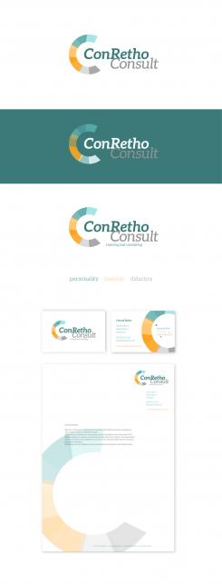
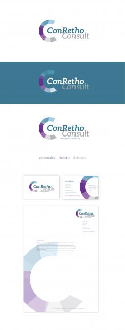
Thank you for your reaction. I understand you concern about the 'C' and made some changes. Firstly the colour; you can see in both new proposals the difference the use of colour can give. Association with colours are very strong. I also changed the shapes inside the 'C' They were round, now they are more sharp, less playfull and hopefully less 'painty'. Please let me knwo what you think.
Regards!
Jo - Mooiniet
Hello Conrehto,
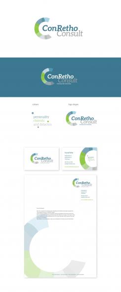
Hereby my propsal for a logo and stationairy. I choose to incorporate three colours in the design, each colour reflecting the three methods you use. Blue for personality, green for rhethoric en grey for didactic. These three colours are combined into a circle in whch the namlogo is placed. For a good balnce, a part of the circle is cut of, to form a 'C'. This icon is repeated in the businesscard and stationairy.
Please let me know what u think, alteration are always possible.
Regards,
Jo - Mooiniet
 Nederland
 België
 France
 Deutschland
 Österreich
 United Kingdom


