Good evening Annelies,
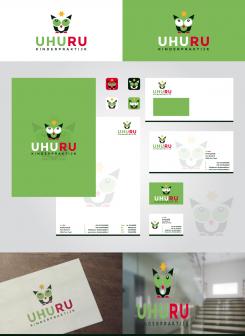
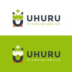
attached you find a new variation of my previous proposals. I changed the appearance of the owl a bit, to get it to look a little less stiff ;)
I thought a while and got to the conclusion, that, in my opinion, a star fits best, and gives space for identification with your personal favorite.
If you like it and have suggestions to improve the design, I'll remain at your disposal,
kind regards, Dagmar
Logo & house style for children's practice Uhuru (Kinderpraktijk Uhuru)
- Contest holder: ACornel
- Category: Logo & stationery
- Status: Ended
- Files: File 1, File 2
Start date: 30-11-2017
Ending date: 14-12-2017
It all started with an idea...
A short, interactive guide helped them discover their design style and clearly captured what they needed.
Brandsupply is a platform where creative professionals and businesses collaborate on unique projects and designs.
Clients looking for a new logo or brand identity describe what they need. Designers can then participate in the project via Brandsupply by submitting one or more designs. In the end, the client chooses the design they like best.
Costs vary depending on the type of project — from €169 for a business or project name to €539 for a complete website. The client decides how much they want to pay for the entire project.
Good morning Annelies ;)
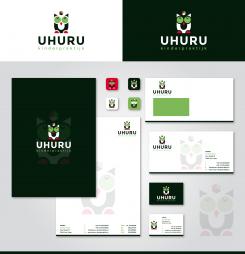
Took a bit, but attached now you find a first design for an according housestyle. In this one I used a box over the owl, as a container that could include various things. I also added a little light to the iris of the eyes to give a slightly cuter look. Hope you like it and look forward to hear your opinion,
best regards, Dagmar
Good morning Annelies,
thank you again for your feedback. Attached the revision with the eyes from the first proposal and a different idea for the image on top... curious to know, if you like this variation ;),
kind regards, Dagmar
Hi Dagmar,
Thanks for the new version. The eyes now are just perfect. What should be on the question mark stays a question mark to me :-D
The question mark is not working for me, it is now something hanging above the owl, instead of something part of the owl.
I will try to think of something we can use there. For now this is okay.
Kind regards,
Annelies
Hi Annelies,
thanx again ;) for the rating and feedback. The question mark was meant to be a mixture of the mark and a light bulb, a bit like question and answer/idea. What about a tiny mouse instead?
Does it make sense to already design the according housestyle?
Kind regards, Dagmar
Hi Dagmar,
Ah I see what you meant. I don't know about the tiny mouse. What about eyebrows for the owl shaped like flags, like a target, on top of a mountain, triangle shaped flags. I will add a example as an attachement, but offcourse I am not good enough to make it look good enough.
I still like the design you made, its between you and another, so yeah I am curious about a housestyle from you.
Thanks in advance.
Greetings,
Annelies
It's file 3, attached in the description. If you have it I will delete it again
Good morning ;)
Thank you for your positive feedback and rating. Attached you find a first revision, I will get back to you soon with some more ideas about the owl eyes and the toys on top ;) Looking forward to your reply,
kind regards, Dagmar
Thanks Dagmar,
I think we are moving in the wrong direction with the eyes. We are moving away from the simplicity. I think the eyes of the owl with the white eye-white on your first version were perfect. Now seeing your new version I think the "creepy" thing about the owl with green eye-white was the fact that the iris is a lighter color than the 'eye-white', it looks like a negative. If you make the iris color darker, just like you did on your second version, probably it will be perfect.
I think the wooden blocks on top is not in proportion, it is to big. Or maybe the thing working for the Plus is the fact that bottom up it has the same angle as the top ends of the U. Maybe we can find something that truly works, because I think it works to have something there. In hindsight maybe toys wasn't the best suggestion from me, because I can't think of a toy that speaks to all ages, and does not give the wrong suggestion. For instance using brushes gives the idea that is stands for a hobby club. But maybe you can make it work. But you don't have to limit yourself to toys :-D
Thanks for your quick reply.
Good morning ACornel,
attached my first design for your contest. I picked up your idea with the owl and incorporated it to the U letter of your name. Hope you like it,
kind regards, Dagmar
Wow that looks great. I really like the simplicity of the design, and I really like the color green you have chosen.
Only the thing is the owl with the green eyes looks a bit creepy (too big a word, but I hope you know what I mean) to me, I think a small alteration can make a big difference.
One other thing I don't especially like is the plus sign, in my opinion this makes the Owl to clinical/ creates a link to nurses/hospitals. I forgot to mention that the therapy is through playing. So can the plus be replaced by something like a toy, or something else you think is suitable?
Just as I said the simplicity is great. I also can imagine some variations on the owl by playing around with only the eyes. For instance next to a text about shyness an image of the owl is present with the eyes turned down. Confusion, the eyes are all around the place. Scared, big eyes etc.
So I see a lot of possibilities in the figure of the owl.
I hope you can make the suggested alterations. Thanks in advance.
 Nederland
 België
 France
 Deutschland
 Österreich
 United Kingdom
