We have a rescue wheel that represents confidence.
The platform at the center symbolizes strength and balance. This translates equity and sustainability.
The platform symbolizes several companies at sea.
The platform also symbolizes marine metallurgy, welding, naval engineering.
The stars symbolize the continents (America, Europe and Asia, Oceania and Africa).
The stars symbolize the international.
The stars represent the best profiles recruited.
The rescue wheel symbolizes Van Storm who saves job seekers from drowning unemployment. The platform symbolizes Van Storm because it is a recruiting platform in naval engineering.
The tricolor (The blue, white, red) symbolizes the Dutch flag.
Blue symbolizes seas and oceans.
The logo is like a shield that symbolizes trust.
The co-operative job seekers, Van Storm and companies in the sea is a cooperation of trust, fairness and sustainability.
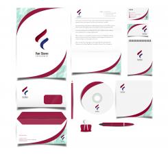
Logo & stationary for a new RECRUITMENT firm for NAVAL ENGINEERING based in AMSTERDAM
- Contest holder: dsawa
- Category: Logo & stationery
- Status: Ended
- Files: File 1, File 2, File 3
Start date: 01-02-2018
Ending date: 08-02-2018
It all started with an idea...
A short, interactive guide helped them discover their design style and clearly captured what they needed.
Brandsupply is a platform where creative professionals and businesses collaborate on unique projects and designs.
Clients looking for a new logo or brand identity describe what they need. Designers can then participate in the project via Brandsupply by submitting one or more designs. In the end, the client chooses the design they like best.
Costs vary depending on the type of project — from €169 for a business or project name to €539 for a complete website. The client decides how much they want to pay for the entire project.
We have a rescue wheel that represents confidence.
The anchor in the center symbolizes strength and balance.
The anchor helps stabilize and balance the ship. This reflects equity and sustainability.
The anchor symbolizes a boat (a company at sea).
The anchor also symbolizes marine metallurgy, welding, naval engineering.
The stars symbolize the continents (America, Europe and Asia, Oceania and Africa).
The stars symbolize the international.
The stars represent the platforms (companies in the seas) on the oceans in plan view.
The stars represent the best profiles recruited.
The anchor is also a harpoon that allows to fish big fish (whale, shark ...)
The harpoon symbolizes Van Storm and the big fish symbolize the best profiles (the stars) .The rescue wheel symbolizes Van Storm who saves job seekers drowning from unemployment.
The tricolor (The blue, white, red) symbolizes the Dutch flag.
Blue symbolizes seas and oceans.
The logo is like a shield that symbolizes trust.
The co-operative between job seekers, Van Storm and companies in the sea is a cooperation of trust, fairness and sustainability.
 Nederland
 België
 France
 Deutschland
 Österreich
 United Kingdom


