No comments
New CBD Eliquide Brand
- Contest holder: Francoisjdc
- Category: Logo & stationery
- Status: Ended
Start date: 19-12-2017
Ending date: 18-01-2018
It all started with an idea...
A short, interactive guide helped them discover their design style and clearly captured what they needed.
Brandsupply is a platform where creative professionals and businesses collaborate on unique projects and designs.
Clients looking for a new logo or brand identity describe what they need. Designers can then participate in the project via Brandsupply by submitting one or more designs. In the end, the client chooses the design they like best.
Costs vary depending on the type of project — from €169 for a business or project name to €539 for a complete website. The client decides how much they want to pay for the entire project.
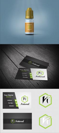
Hello @Francoisjdc, My logo has a certain fluidity that can offer nature, the circle is a symbol that reassures and attracts, it represents unity, it is a form found everywhere in nature unlike others like the square which is a human invention. Green, the dominant color of this logo and which connotes nature as well. The typography I chose in baseline comes from Switzerland: for the side you were looking for. These logos adapt to any media and colors.
Everything can be changed, I remain at your disposal.
 Nederland
 België
 France
 Deutschland
 Österreich
 United Kingdom
