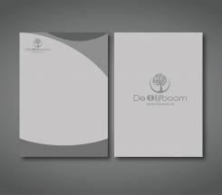
Here the new design for the condoleancecard
Nursingpractice wants new fresh logo!
- Contest holder: Cadi-Care
- Category: Logo & stationery
- Status: Ended
Start date: 31-08-2016
Ending date: 07-09-2016
It all started with an idea...
A short, interactive guide helped them discover their design style and clearly captured what they needed.
Brandsupply is a platform where creative professionals and businesses collaborate on unique projects and designs.
Clients looking for a new logo or brand identity describe what they need. Designers can then participate in the project via Brandsupply by submitting one or more designs. In the end, the client chooses the design they like best.
Costs vary depending on the type of project — from €169 for a business or project name to €539 for a complete website. The client decides how much they want to pay for the entire project.
No comments
I love the colors! Have to think about the O though
I will change the O if it´s not the style that your looking for :)
On second view, I like it better then the cross in the o!
I think you're a possible winner
Thats great to hear. Shall I change the condoleancecard as well. WIth the new design?
yes you can keep the new design
Hello,
I adjust the logo with solid colors and I changed the O of olijfboom.
I used the grey also from the codoleancecard
Hello,
here the design in format 11cm x21cm
I love it!
Great to hear.
Do you want to see something els? The logo or different colors?
No comments
Very nice! Could you make it 11 x 21 cm format?
I'm gonna let it sink in a bit, and I'will let you know!
No problem! Please do. So I can make sime changes :)
No comments
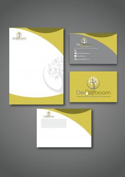
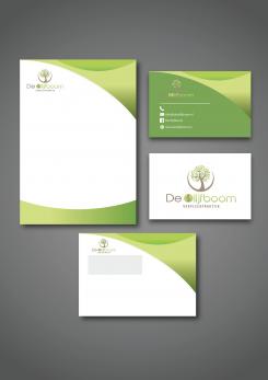
Here a design for a letter and businesscard :)
The design for the letter will be the same for the condoleancecard. So everything looks the same and fits together with the design
but I can make a condoleancecard that looks a little bit different, but still fits teh rest of the designs
Well done. The would rather love the see the condoleancecard in less bold colors, even gray would do well...
Making the card light grey instead of green would allready work nicely I presume. Nothing major has to change...
Hello,
In this design I adjust the cross in the olive. So it's more recognisable.
Regards,
Melvin
Thanks Melvin! Well done. Could you make me a design for a lettre, a businesscard and a condoleancecard? That last one to give to family of a deceased patiënt.
Yourwelcome! Off course.
No comments
Nice design!! When I see the O upclose, I can see the cross. From a distance the brownish things blur the image of the cross. Or is that a hint of olive?
Thank you! Yeah The O has the form of a olive and indeed a cross in it. Its like peeling the Olive, but I can make it better the O. So its better to see the clue
 Nederland
 België
 France
 Deutschland
 Österreich
 United Kingdom

