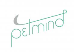
PetMind - Animal Behaviour and training services
Contest details:
Bronze
- Contest holder: laura.mccarthy@hotmail.co.uk
- Category: Logo & stationery
- Total budget: € 249.00
- Start date : 01-08-2017 15:46
- Ending date : 31-08-2017 00:00
- Status : Ended
- Required formats: jpg,ai,pdf,vector or .eps can be discussed
- Relevant files: None
- Available languages:
- Number of designs: 123
-
Response rate:
low high
Needs:
I need a logo for print and web usage (perhaps also for merchandise) so would be useful to have several colour options (including B+W)
Company description:
I am hoping to start a company (PetMind) and need branding (including copyright) for a company that offers the following:
Behaviour Consultations for pets for problems such as aggression, nervousness, house-soiling, destruction, separation issues and repetitive behaviours.
One to one training (puppy/kitten advice, house training, recalls, leash walking, co-operative handling, tricks, advice for changes in the home e.g.: moving home, elderly animals, new babies, decorating)
Pet walking (dogs of any size)
Pet boarding (all small animals)
Target group:
I use positive, fun and scientific training principles to allow owners and animals to make better choices and strengthen their relationships. Advice and training is based on applied behaviour analysis (finding out what the motivation and reinforcing elements are in a behaviour) and then replacing or redirecting these behaviours for a more harmonious life.
Therefore I would like my image to convey professionalism, reliability, caring and fun.
Colors, favourites and other requirements
I like simple logos that aren’t too busy (not too many colours together) and have attached a couple that I have seen and liked. I'm not keen on cartoons - prefer outlines or silhouettes - nor do I really like animals in clothing. I would love to use a german shepherd as that is the dog I have, but haven't really found a depiction that captures their softer or playful side... I have also attached a small sketch outline of my dog Inca (please don't laugh - it is pretty rough!) it is goofy, but gives an idea of how I see her :) but don't feel constrained by this - I am happy for other images to be used as I don't think my one is very good at all!
As my differentiator is that I offer services for other animals (cats, rabbits, parrots, birds of prey, reptiles) it would be great for the logo to convey this, but I haven’t really seen any so far with multiple animals in that don’t look too busy for my tastes – so maybe best to just stick with one image - up to you!
Colour-wise I love natural tones (blues, greens, greys) in both pastel and citrus tones.
Font-wise I am happy to be flexible but have seen the following that I like if at all helpful:
Simple and clean like:
Horus seraph, FF Blur, Proxima nova, Foco, Axis, Azedo, Elegant Lux pro, Poiret, Prosto, Simplifica, Odin rounded
Or slightly funky like:
Stay writer, Cavorting, Bellboy, Ludicrous, Fofer, Stockyard, Balqis, The woodlands, King basil, Milkshake, Variane script, Debby, Christopher hand
It may even be cool to have the two words in different fonts :)
I also have a pintrest board of saved ideas:https://www.pinterest.co.uk/mccarthy9763/company-logo-ideas/
Thanks and look forward to hearing from you!!
TOPhelders
-
-
Description by designer TOPhelders:
And with the font you send me
-
laura.mccarthy@hotmail.co.uk says :
Thank you. I think i prefer this font without the additional spacing between characters and with the P and M capitalised. Also if you remove the line that you have in the other font (running through the t) then I think the graphic of the dog may look better larger in comparison to the words and also rotated slightly more clockwise so it is closer to the horizontal. Picky I know!
-
This contest is finished. Its not possible to reply anymore.
-
-
-
Description by designer TOPhelders:
He,
I worked on the design with your feedback. And here it the result :) I hope you like it!
Let me know what you think :D
Grtz -
laura.mccarthy@hotmail.co.uk says :
I like what you have done with the colouring of the font, but the 'e' doesn't look right to me I feel like a normal lower case 'e', but with the straight line in the 'e' echoing the angle of the line above would tie in nicely.
-
This contest is finished. Its not possible to reply anymore.
-
-
-
laura.mccarthy@hotmail.co.uk says :
Really love this - so simple and clean and the graphic is spot on. Can you do a more typical 'e' with this font or are you constrained? Also is it possible to make Pet and Mind look like different words either by capitalising or changing the font colour or style? Thank you :)
-
TOPhelders says
Thank you. I designed the font so that's not a problem and I will do that.
Thanks for the feedback :) -
This contest is finished. Its not possible to reply anymore.
-
-
-
Description by designer TOPhelders:
I made this logo with a reference of a tale of a dog
-
laura.mccarthy@hotmail.co.uk says :
Thank you for you submission. I very much like the font and the colours are great. I would like something with a little more of an illustration, but this is very clean :)
-
This contest is finished. Its not possible to reply anymore.
-