Here is another version of the stationery.
Best regards,
Aleksandra
Predict
- Contest holder: Meindert
- Category: Logo & stationery
- Status: Ended
Start date: 12-02-2013
Ending date: 28-02-2013
It all started with an idea...
A short, interactive guide helped them discover their design style and clearly captured what they needed.
Brandsupply is a platform where creative professionals and businesses collaborate on unique projects and designs.
Clients looking for a new logo or brand identity describe what they need. Designers can then participate in the project via Brandsupply by submitting one or more designs. In the end, the client chooses the design they like best.
Costs vary depending on the type of project — from €169 for a business or project name to €539 for a complete website. The client decides how much they want to pay for the entire project.
Hello,
here is my stationery proposal.
Regards,
Aleksandra
Thank you for the stars rating and for the feedback. I hope this colors are good now. Please let me know if you would like me to change anything else before I make the corporate identity.
Best regards,
Aleksandra
I changed the colors for this one too. I used some pastel tones. If you had something different in mind please let me know.
Best regards,
Aleksandra
We like this square logo design, however we believe we have to go for a grey/red/orange color combination.
Hello,
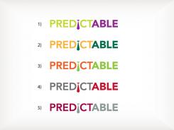
thank you for the feedback. Here are 5 new proposals for a different color combinations. I combined only 2 colors for each. If you have any color preference, please let me know.
Aleksandra
We prefer your other design. The i in the logo is to much a gimmick. With some imagionation it looks like a tie and is therefore to funny.
No 2a, with a small variation to the "i".
colour of the logo is quite difficult on paper and business cards...... the I gimmick is quite good
colour of the logo is quite difficult on paper and business cards...... the I gimmick is quite good
colour of the logo is quite difficult on paper and business cards...... the I gimmick is quite good
Most accounting firms do have in one way or another .. blue or gray with yellow .. Rather no blue in color..
KPMG - Blue
Deloitte - Blue
Enst and Young - Yellow Grey
Accon - Yellow Grey
Mazars - Brown?
Birch - Blue
MTH, no obvious color - but that is most like Red ..
PwC, has something orange ..
 Nederland
 België
 France
 Deutschland
 Österreich
 United Kingdom
