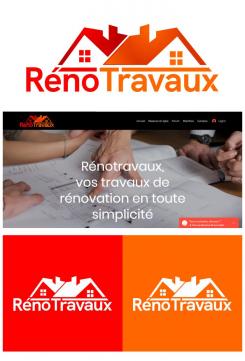
The logo is inspired by the shape of the house, because it is in accordance with the field that is done by the company, namely renovating and beautifying the house.
so if the client sees the logo of this company, the client will immediately know that this company is engaged in renovating and beautifying homes.
Renotravaux
- Contest holder: Alexisjau
- Category: Logo & stationery
- Status: Ended
Start date: 28-09-2020
Ending date: 14-11-2020
It all started with an idea...
A short, interactive guide helped them discover their design style and clearly captured what they needed.
Brandsupply is a platform where creative professionals and businesses collaborate on unique projects and designs.
Clients looking for a new logo or brand identity describe what they need. Designers can then participate in the project via Brandsupply by submitting one or more designs. In the end, the client chooses the design they like best.
Costs vary depending on the type of project — from €169 for a business or project name to €539 for a complete website. The client decides how much they want to pay for the entire project.
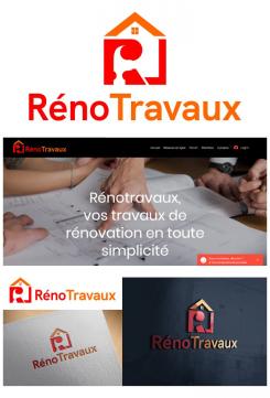
The renotravaux logo is inspired by the shape of the house and hammer.
the letter "R" in the logo is taken at the beginning of the company name and is combined with the house and hammer.
The letter "R" on the logo is uniquely designed, with a hammer indicating the negative space in the center of the R and the house that surrounds it.
The shape of the house in the logo is defined as the work the company does for its clients, namely renovating and beautifying the client's home.
The hammer in the logo is defined as a tool that is always present in every renovation or to beautify a house.
The letter "R" in the logo is defined as the main logo that represents the entire work of the company.
This logo is designed to look modern, dynamic, professional and easy to understand.
Every client who sees it will immediately know that the logo on the company is engaged in renovating and beautifying homes.
 Nederland
 België
 France
 Deutschland
 Österreich
 United Kingdom


