The Modern Tea Brand: minimalistic, modern, social tea brand

Start date: 01-05-2018

Ending date: 15-05-2018

Total budget: € 125.00
Latest design
Book cover
MilTod

It all started with an idea...

A short, interactive guide helped them discover their design style and clearly captured what they needed.

Needs


We would like to have a very minimalistic logo and house style to support our modern brand. Further personality traits we would like to express are Straightforward and Quality-oriented, but the minimalism might minimize those traits in the house style.

We named the brand “T”, the most minimalistic name we could come up with for a tea brand.

We would like you to design a logo and house-style for the tea brand.

Extra information:

Our brand values: Responsible, Down to earth, Transparent, Excellence, and Innovation.

In previous iterations we really liked just the letter “T” as the logo, with a rectangle and stripe around it to resemble a very minimalistic tea bag. We very much like this as a starting point, but if you have different ideas, we would love to see them.

I have a background as a branding strategist with some graphic design experience, and plan to give feedback on a daily basis.

Company description


We are starting a tea brand selling high quality, organically produced, hand-plucked, orthodox tea. Our tea is produced in Nepal, where we have connected with different small-scale tea farmers. We pay good prices for the tea they produce.

We are going with a modern brand as we believe that a modern brand should not only focus on high quality products, but also on ethically responsible business operations. Our tea is ‘real’, compared to many of the tea’s found in the Dutch supermarket. We are working on a promo video of the farmers plucking the tea and processing the tea further to show where our tea comes from.

We will have quite a wide assortment of tea types. We have our two ‘best’ types, which are not available all year through because of their exclusivity, called Golden Needles and Silver Needles.

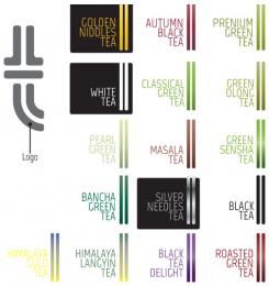
Besides these, we have Black tea (golden tips), White tea, Premium Green tea, Pearl Green Tea, Green Oolong tea, Masala tea, Green Sencha tea, Bancha Green tea, Roasted Green Tea, Classic green tea, Autumn Black Tea, Himalayan Gold Tea, Himalayan Longyin Tea, Black Tea Delight.

Target group


Colors, favourites and other requirements


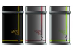
On our packaging we would like to show the type of the tea and year of plucking (different years have different qualities, like with wine). An idea that we liked from earlier explorations is to have a different color packaging for every type of tea.

We will be selling the tea in tin cans.

Designer: yannick62 yannick62
design_logo_identite_entreprise-yannick62-VlqOKppw

No comments

This contest is finished. Its not possible to reply anymore.
design_logo_identite_entreprise-yannick62-SgFmJRtw

No comments

This contest is finished. Its not possible to reply anymore.
design_logo_identite_entreprise-yannick62-fD3RoDU8

yannick62yannick62

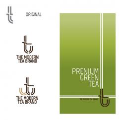
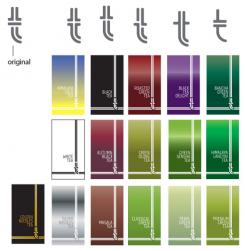
For the first logo, I especially refined the line because too thick, not making it modern. and also, make it look more like a T

for the 2nd version of the logo.
I worked on the principle of the anchor of boat by integrating the T ...
because in ancient times tea was transported by sea.
but I believe that minimalism is lost, lol

casparsmitscasparsmits

Haha yeah I understand what you mean. I agree, the logo became less minimalistic and I think it might be able to stand out more through minimalism, but I don't know how to make the T more minimalistic in this design. Do you have ideas?

The thinner lines do work better indeed. About the boat, I'm not sure our customers will make that connection.

This contest is finished. Its not possible to reply anymore.
design_logo_identite_entreprise-yannick62-EBUroqEC

yannick62yannick62


Hello,
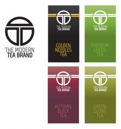
Following your remarks, I reworked on the whole.
I'm waiting for your suggestions.
cordially

casparsmitscasparsmits

I like the packaging ideas with the lines, there are many opportunities to use those on store walls etc. Our concern is that the logo by itself does not stand out enough. Do you have ideas on how to make it stand out more, possibly in a modern way?

This contest is finished. Its not possible to reply anymore.
design_logo_identite_entreprise-yannick62-321LBzwe

No comments

yannick62yannick62

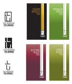
desolé pour le T sur la boite noir car sur photoshop, il est visible et non visible sur brandsupply

casparsmitscasparsmits

This looks interesting and nice. I would like to see some more regarding various forms that the T - logo could look like. (maybe use only one line or three lines). We can than have a further impression of the logo.

This contest is finished. Its not possible to reply anymore.
design_logo_identite_entreprise-yannick62-1nNtaFAe

yannick62yannick62

bonjour,
voici mon travail

casparsmitscasparsmits

Merci beaucoup!

Could you also play around with the background colours?
PS: small detail - use 'needles' rather than 'niddles'

This contest is finished. Its not possible to reply anymore.