No comments
The Modern Tea Brand: minimalistic, modern, social tea brand
- Contest holder: casparsmits
- Category: Logo & stationery
- Status: Ended
Start date: 01-05-2018
Ending date: 15-05-2018
It all started with an idea...
A short, interactive guide helped them discover their design style and clearly captured what they needed.
Brandsupply is a platform where creative professionals and businesses collaborate on unique projects and designs.
Clients looking for a new logo or brand identity describe what they need. Designers can then participate in the project via Brandsupply by submitting one or more designs. In the end, the client chooses the design they like best.
Costs vary depending on the type of project — from €169 for a business or project name to €539 for a complete website. The client decides how much they want to pay for the entire project.
No comments
Hi Krisi,
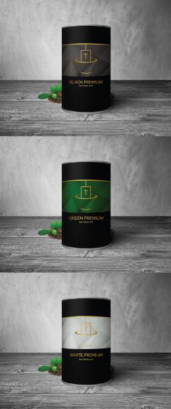
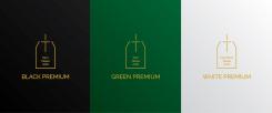
We are quite curious how this would work with different color combinations, on packaging. Could you put the design on packaging in different color combinations (for the different types of tea)? We kinda like this template, but if you have better ideas please do so. (the first one of https://free-psd-templates.com/free-tea-packaging-mock-up/)
Best,
Caspar
No comments
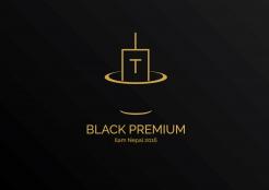
Hi Krisi, would you be able to take the text below the logotype and see if you the cup looks cool without the text in it? We'd like to use it seperately as well
No comments
Hi Krisi,
I like how the tea bag dissappears into the cup, very creative. It took me just a bit too long to notice though, do you think you could make it more clear, by brining more depth into it (layers)?
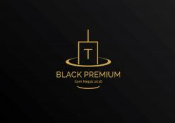
The way the T is implemented into the tea bag is smart, but doesn't fit our style, I think it makes the logo look less minimalistic and modern. It might work better if the tea bag is simpler in shape, and the T is in the middle of the tea bag. Could you try that?
No comments
Hi Krisi,
We communicated this poorly before; we are not using the packaging we had in the description (we updated the description). Feel free to use any colors you'd like. Also, we will be selling our tea in cans.
About your design: I think it's a nice idea to put the text description in the tea bag, but I think combining it this way is not necessary for us: we'd like a more stand-out logo and can put the text on another place in the packaging. I think the thin lines make it stand out less. Would you be able to design a more stand-out, minimalistic logo?
 Nederland
 België
 France
 Deutschland
 Österreich
 United Kingdom
