The Modern Tea Brand: minimalistic, modern, social tea brand

Contest details:

  • Contest holder: casparsmits
  • Category: Logo & stationery
  • Total budget: € 125.00
  • Start date : 01-05-2018 08:23
  • Ending date : 15-05-2018 00:00
  • Status : Ended
  • Relevant files: None
  • Available languages:
  • Number of designs: 118
  • Response rate:
    low high

Needs:

We would like to have a very minimalistic logo and house style to support our modern brand. Further personality traits we would like to express are Straightforward and Quality-oriented, but the minimalism might minimize those traits in the house style.

We named the brand “T”, the most minimalistic name we could come up with for a tea brand.

We would like you to design a logo and house-style for the tea brand.

Extra information:

Our brand values: Responsible, Down to earth, Transparent, Excellence, and Innovation.

In previous iterations we really liked just the letter “T” as the logo, with a rectangle and stripe around it to resemble a very minimalistic tea bag. We very much like this as a starting point, but if you have different ideas, we would love to see them.

I have a background as a branding strategist with some graphic design experience, and plan to give feedback on a daily basis.

Company description:

We are starting a tea brand selling high quality, organically produced, hand-plucked, orthodox tea. Our tea is produced in Nepal, where we have connected with different small-scale tea farmers. We pay good prices for the tea they produce.

We are going with a modern brand as we believe that a modern brand should not only focus on high quality products, but also on ethically responsible business operations. Our tea is ‘real’, compared to many of the tea’s found in the Dutch supermarket. We are working on a promo video of the farmers plucking the tea and processing the tea further to show where our tea comes from.

We will have quite a wide assortment of tea types. We have our two ‘best’ types, which are not available all year through because of their exclusivity, called Golden Needles and Silver Needles.

Besides these, we have Black tea (golden tips), White tea, Premium Green tea, Pearl Green Tea, Green Oolong tea, Masala tea, Green Sencha tea, Bancha Green tea, Roasted Green Tea, Classic green tea, Autumn Black Tea, Himalayan Gold Tea, Himalayan Longyin Tea, Black Tea Delight.

Target group:

Colors, favourites and other requirements

On our packaging we would like to show the type of the tea and year of plucking (different years have different qualities, like with wine). An idea that we liked from earlier explorations is to have a different color packaging for every type of tea.

We will be selling the tea in tin cans.

logoman
  • Logo & stationery # 854953 for The Modern Tea Brand: minimalistic, modern, social tea brand contest Submit complaint
    1. No comments

    2. This contest is finished. Its not possible to reply anymore.

  • Logo & stationery # 854650 for The Modern Tea Brand: minimalistic, modern, social tea brand contest Submit complaint
    1. logoman says

      Hi,
      here you have it.
      Let me know your feedback about it.
      Best,
      L

    2. casparsmits says :

      Hi logoman,

      Thank you for your redesign! We had three questions:
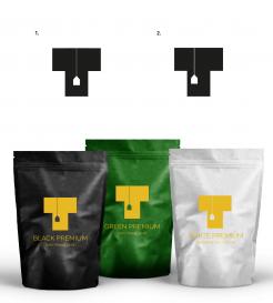
      - Could you make the horizontal bar of the T thinner, so it looks a bit more like a T?
      - Could you experiment with different color combinations related to our different types of tea?
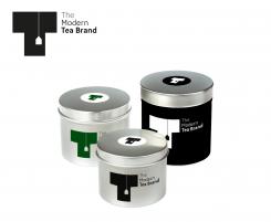
      - Could you add the text of the type of tea as well? I'd like to see how the logo works with more information on the packaging.

      I'm looking forward to see more!

      Best,
      Caspar

    3. This contest is finished. Its not possible to reply anymore.

  • Logo & stationery # 853951 for The Modern Tea Brand: minimalistic, modern, social tea brand contest Submit complaint
    1. logoman says

      ello,
      thanks for your feedback.
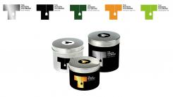
      Here are some color combinations.
      Best,
      L

    2. casparsmits says :

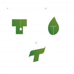
      From these three, we'd go with number 1. We'd like to see it more minimalistic though; I think making it more 'flat', without the gradient would be better. Could you try different color combinations? On tin can packaging would be best, if possible

    3. This contest is finished. Its not possible to reply anymore.

  • Logo & stationery # 853259 for The Modern Tea Brand: minimalistic, modern, social tea brand contest Submit complaint
    1. casparsmits says :

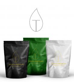
      Hi logoman, I think your other design works better for us. I think it doesn't stand out strongly enough, maybe because of the thin lines.

    2. This contest is finished. Its not possible to reply anymore.

  • Logo & stationery # 853223 for The Modern Tea Brand: minimalistic, modern, social tea brand contest Submit complaint
    1. casparsmits says :

      Hi logoman, I think we communicated this poorly before (we updated the description) but we don't want to use this packaging/these specific colors, but tin cans. I think the packaging doesn't do justice to your design. I would like to see what you do with your own color combinations using this logo. Would you be able to show us?

    2. This contest is finished. Its not possible to reply anymore.

Social Network