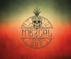
How about this one?
We are looking for a logo / corporate identity
- Contest holder: niek83
- Category: Logo & stationery
- Status: Ended
- Files: File 1, File 2, File 3
Start date: 22-09-2016
Ending date: 21-10-2016
It all started with an idea...
A short, interactive guide helped them discover their design style and clearly captured what they needed.
Brandsupply is a platform where creative professionals and businesses collaborate on unique projects and designs.
Clients looking for a new logo or brand identity describe what they need. Designers can then participate in the project via Brandsupply by submitting one or more designs. In the end, the client chooses the design they like best.
Costs vary depending on the type of project — from €169 for a business or project name to €539 for a complete website. The client decides how much they want to pay for the entire project.
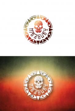
It's an interesting concept too. I only miss the agave plant. maybe put the agave plant instead of the rose on the front head. In the logo on the white the details in the skull kind of disappear.
Is it also possible to put colors in the details of the skull (example: http://www.clipartkid.com/images/367/sugar-skull-clip-art-gBxCRK-clipart.jpeg).
Something more like this?
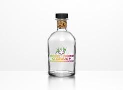
I left some feedback on the one you deleted. I think it would be good to give the skull and the plant some color; so it jumps out of it. Our wish is to put the logo on a blank bottle so it's important that the logo is powerful and draws attention to the customers.
How the logo is right now is more for a watermark on a website or a commercial photo.
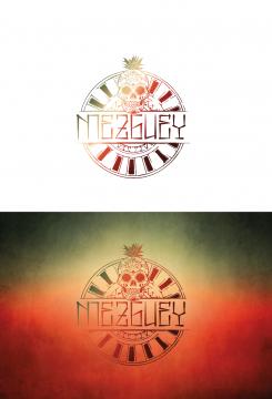
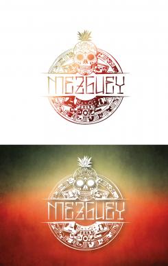
Besides that I think that the patterns should be a little less but still in an aztec way. I think it's a little bit too busy right now!
No comments
I like the total picture as an corporate identity. Something like a watermark as a background for a website.
But as a logo I miss colors in the image that gives the happy celebration sensation. Besides that I think the agave/ meguey plant doesn't look like to much like agave plant. It's too flat.
What if I put the gradient into the logo, fill the little squares and than put the logo on a white background?
By the way, I like the letters you have used in this images! Can you make it with the word Mezguey.
The patterns (little squares) in the circle are nice too. Can you get it closer to a bit more like the aztec pattern style. (look for the aztec calendar)
 Nederland
 België
 France
 Deutschland
 Österreich
 United Kingdom
