I have changed the logo according to your feedback.
I hope you are pleased.
if for example you want to change again, please let me know
Which of you would like to help me with a Fresh and Sleek multifunctional logo and corporate identity
- Contest holder: GerbenH
- Category: Logo & stationery
- Status: Ended
Start date: 01-03-2021
Ending date: 22-03-2021
It all started with an idea...
A short, interactive guide helped them discover their design style and clearly captured what they needed.
Brandsupply is a platform where creative professionals and businesses collaborate on unique projects and designs.
Clients looking for a new logo or brand identity describe what they need. Designers can then participate in the project via Brandsupply by submitting one or more designs. In the end, the client chooses the design they like best.
Costs vary depending on the type of project — from €169 for a business or project name to €539 for a complete website. The client decides how much they want to pay for the entire project.
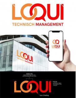
This logo is inspired by the people who are interacting, namely in the letters O&Q there is also a chat icon in the letter Q.
Interacting in a logo is defined as being able to regulate everything in the company, both individually and in groups.
The letters L&I cut above are in the form of an arrow pointing upwards, symbolizing the company's progress going forward.
so as a whole this logo can represent a company engaged in management.
 Nederland
 België
 France
 Deutschland
 Österreich
 United Kingdom


