 Nederland
 België
 France
 Deutschland
 Österreich
 United Kingdom
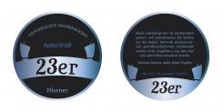
Hallo, liebe Bierbrauer,
hier mein Entwurf. Habe versucht, ein bisschen Moor-Atmospäre zu erzielen. Das Etikett lässt sich jederzeit auch in Oval gestalten und aus dem Bild ist auch gut ein Logo zu entwickeln... ein Halsetikett in Lang ist ebenfalls möglich!
Viele Grüße ins Teufelsmoor!
Start date: 22-03-2014
Ending date: 22-04-2014
Total budget: € 159.00
Latest design
It all started with an idea...
A short, interactive guide helped them discover their design style and clearly captured what they needed.
Brandsupply is a platform where creative professionals and businesses collaborate on unique projects and designs.
Clients looking for a new logo or brand identity describe what they need. Designers can then participate in the project via Brandsupply by submitting one or more designs. In the end, the client chooses the design they like best.
Costs vary depending on the type of project — from €169 for a business or project name to €539 for a complete website. The client decides how much they want to pay for the entire project.
Designer:
 lamby
lamby
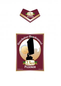
Hallo, vielen Dank für den Vorschlag. Das Etikett gefällt mir gut. Der Torfkahn und die Landschaft stehen allerdings zu sehr im Vordergrund. Etwas dezenter wäre mir lieber. Das Halsetikett sollte in Lang sein. Viele Grüße Dirk Unglaube
This contest is finished. Its not possible to reply anymore.