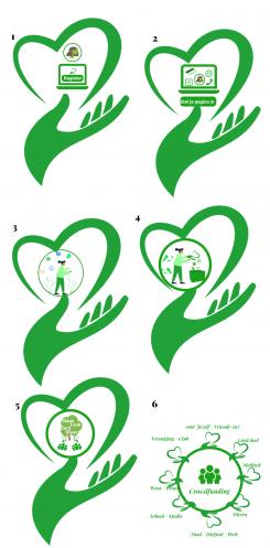
6 illustrations graphics for website
Contest details:
Bronze
Needs:
We are a crowdfunding platform (donations, not financial)
We are looking for 4 simple symbolic easy to understand graphics/images for the page ‘How does it work’ - www.steunactie.nl/zo-werkt-het that shows
a. register and create an account
b. set up your fundraising page
c. share your fundraiser
d. receive donations
We have now temporarily used graphics from Freepik
And for the landing page: www.steunactie.nl/crowdfunding we need 2 illustrations/graphics:
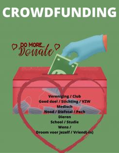
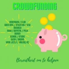
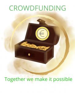
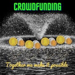
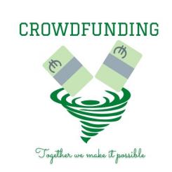
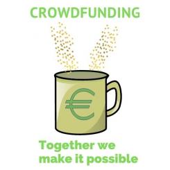
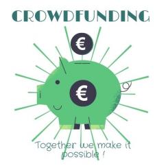
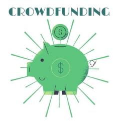
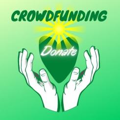
a. illustration showing the essence of crowdfunding: in one glance it must be clear what crowdfunding is about
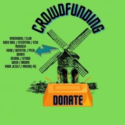
b. an illustration showing the various target groups of crowdfunding / for which purposes crowdfunding can be used.
The target groups that should be mentioned (in Dutch) in this image (2b) are:
Vereniging / Club
Goed doel / Stichting / VZW
Medisch
Nood / Diefstal / Pech
Dieren
School / Studie
Wens / Droom
voor Jezelf / Vriend(-in)
Please see the 2 attached self made illustrations to give you an idea.
All illustrations must convey the same style / look and feel.
In the future we will be needing more illustrations so we would like a permanent contact.
Enclosed is the Steunactie logo as may you want to incorporate this in your proposal.
Colour green: hex #1aa21c
Company description:
Crowdfunding site
Target group:
Anyone who wants to start a fundraising crowdfunding campaign.
Colors, favourites and other requirements
Colour green: hex #1aa21c
GG92
-
-
No comments
-
This contest is finished. Its not possible to reply anymore.
-
-
-
No comments
-
This contest is finished. Its not possible to reply anymore.
-
-
-
No comments
-
This contest is finished. Its not possible to reply anymore.
-
-
-
No comments
-
This contest is finished. Its not possible to reply anymore.
-
-
-
No comments
-
This contest is finished. Its not possible to reply anymore.
-
-
-
No comments
-
This contest is finished. Its not possible to reply anymore.
-
-
-
No comments
-
This contest is finished. Its not possible to reply anymore.
-
-
-
No comments
-
This contest is finished. Its not possible to reply anymore.
-
-
-
No comments
-
This contest is finished. Its not possible to reply anymore.
-
-
-
HansLange says :
Style ok. Need € sign for money. Need target groups to be mentioned. Rather not use (savings)pig as this does not jive well with the muslim community. Rather another symbol. Need to see all 6 grahpics/images in order to be able to judge.
-
This contest is finished. Its not possible to reply anymore.
-
-
-
HansLange says :
Sorry, don't like this style.
-
This contest is finished. Its not possible to reply anymore.
-