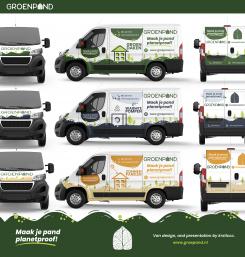
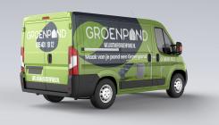
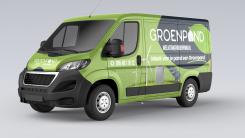
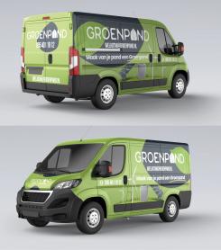
Hello to you, following the competition, I would like to give you my second creation, if you have any questions do not hesitate because I am available to answer you and I have put all my hopes for this creation because I have a good place the texts, images according to the graphic charter and in view of the design are better than before and I don't know if I reached your goal but I did my best to make it come out well. Looking forward to your, Thank you
Design the new van for a sustainable energy company
Start date: 11-06-2021
Ending date: 28-07-2021
It all started with an idea...
A short, interactive guide helped them discover their design style and clearly captured what they needed.
Brandsupply is a platform where creative professionals and businesses collaborate on unique projects and designs.
Clients looking for a new logo or brand identity describe what they need. Designers can then participate in the project via Brandsupply by submitting one or more designs. In the end, the client chooses the design they like best.
Costs vary depending on the type of project — from €169 for a business or project name to €539 for a complete website. The client decides how much they want to pay for the entire project.
Hello, please find my creation attached. And awaiting feedback for changes. Thank you
Thank you for your design and your message! The illustrated elements are a bit too "realistic" for our brand. We typically use simplified shapes and flat shading.
The dark (blue?) color contrasts well with the green, but we feel it's a little much. We typically only use the dark blue color from our palette very sparingly, for things like body text.
 Nederland
 België
 France
 Deutschland
 Österreich
 United Kingdom


