No comments
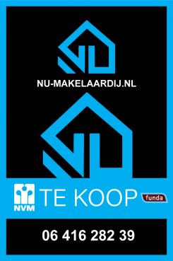
Restyl an existing for sale sign for a real estate agency
Start date: 18-08-2020
Ending date: 01-09-2020
It all started with an idea...
A short, interactive guide helped them discover their design style and clearly captured what they needed.
Brandsupply is a platform where creative professionals and businesses collaborate on unique projects and designs.
Clients looking for a new logo or brand identity describe what they need. Designers can then participate in the project via Brandsupply by submitting one or more designs. In the end, the client chooses the design they like best.
Costs vary depending on the type of project — from €169 for a business or project name to €539 for a complete website. The client decides how much they want to pay for the entire project.
Hello,
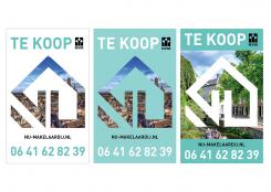
in order to make your sign looks better and to be an eyecatcher, i propose you to add a photo of the city
into the sign. Showing the consumers what is all about.
Please check the three signs and feel free to give your feedback.
Best,
Logoman
sir what type of your work.pl.specify
commercial or residential(multistoreyed or Duplexes)
Hello, residential. Gr
thanks
 Nederland
 België
 France
 Deutschland
 Österreich
 United Kingdom

