 Nederland
 België
 France
 Deutschland
 Österreich
 United Kingdom
No comments
It all started with an idea...
A short, interactive guide helped them discover their design style and clearly captured what they needed.
Brandsupply is a platform where creative professionals and businesses collaborate on unique projects and designs.
Clients looking for a new logo or brand identity describe what they need. Designers can then participate in the project via Brandsupply by submitting one or more designs. In the end, the client chooses the design they like best.
Costs vary depending on the type of project — from €169 for a business or project name to €539 for a complete website. The client decides how much they want to pay for the entire project.
Designer:
 We-Do Graphiz
This contest is finished. Its not possible to reply anymore.
Hi,
what do you think now?
(the "gold" color depends on the printer...)
Hey Guido please check my email again as there is a few bit and peices missing from the brief. Thanks
Sorry, I got confused about the assignment...
This contest is finished. Its not possible to reply anymore.
Hi,
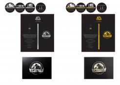
I’ve made the changes you have request, I hope now it is better.
About the texture, I'm still working, (the original pictures are “rectangular”), can I delete someone? how many textures do you need?
What do you think now?
Have a good day.
Guido.
This contest is finished. Its not possible to reply anymore.
No comments
This contest is finished. Its not possible to reply anymore.
Hi,
I tried to make all the changes you have requested, I hope you like them.
The contest is almost over, if you want, you can write to me at my personal email: guidonapoli@hotmail.it
I am at your disposal
Guido.
This contest is finished. Its not possible to reply anymore.
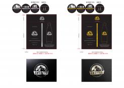
Hi,
here you are! I hope you like it!
This is my idea, but everything is easily editable.
For any request do not hesitate to contact me.
Have a good day!
Guido.
Hey Guido,
many thanks for the submission. It's a nice direction and I'd like you to make the following adaptations if possible:
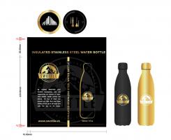
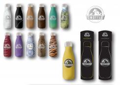
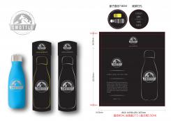
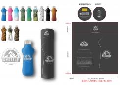
- Can you use the real bottle shape for the designs? Our bottle looks different to the one you portrayed - see attached file in the contest); also I would like to try and portray the full bottle outline instead of just half
- For the background color can we try a nice black with gold or silver for the font (the idea being to bring out the premiumness of the product)
- For the bottom panel, can we have the text run around the outer edge in circular fashion? Maybe we can find a different font that makes it more playful / qualitative?
- For the top panel (hot cold), any chance to rework this a bit as I don't know if consumers will understand the meaning? The idea should be very intuitive that the bottle keeps drinks cold for up to 24 hours and warm up to 12 hours.
This contest is finished. Its not possible to reply anymore.