No comments
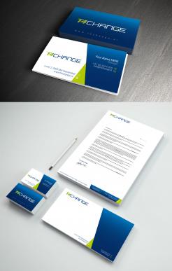
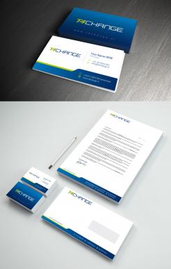
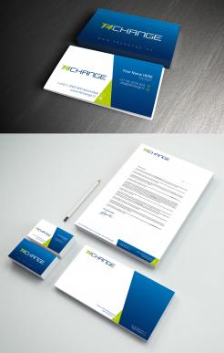
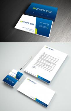
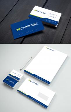
Corporate identity around for our existing logo
- Contest holder: t4changebv
- Category: Stationery design
- Status: Ended
- Files: File 1, File 2, File 3
Start date: 25-09-2020
Ending date: 09-10-2020
It all started with an idea...
A short, interactive guide helped them discover their design style and clearly captured what they needed.
Brandsupply is a platform where creative professionals and businesses collaborate on unique projects and designs.
Clients looking for a new logo or brand identity describe what they need. Designers can then participate in the project via Brandsupply by submitting one or more designs. In the end, the client chooses the design they like best.
Costs vary depending on the type of project — from €169 for a business or project name to €539 for a complete website. The client decides how much they want to pay for the entire project.
No comments
very nice
Thank tou
Thank you
For now, this one is our favorite. It's fresh, clean and simple
No comments
For now, this one is our favorite. It's fresh, clean and simple
Hi,
Do you want us to try a business card that mentions Twitter and LinkidIn?
No comments
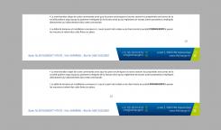
at the bottom is better
I also think, I prefer the bottom one
No comments
your advise is: pagenumber above the adress?
also very curious what your vision is on the powerpoint bit
Yes 2.5cm from the bottom or 1cm above the address should be good
You can program a layout with a margin that you want on all software (Word, Excel, Powerpoint ...).
i fully understand that but part of corporate identity is to create a powerpoint slidedeck with several template pages for uniform presentation.
as an example i included a general deck we are currently using
Hello,
I haven't received anything as an example of a powerpoint presentation, if you want to send it directly by e-mail, otherwise I start working on it, but seeing the contents of your general powerpoint deck could help me enormously
Thank you
It's one of the files attached to this contest
No comments
Hello,
I thank you for the interest brought to my work, if you have any remarks or suggestions do not hesitate to let me know
cordially
I really like this one, but on a practical note, how to deal with reports and page numbering? Is the letter identity also meant for word docs and reporting purposes?
I really like this one, but on a practical note, how to deal with reports and page numbering? Is the letter identity also meant for word docs and reporting purposes?
I really like this one, but on a practical note, how to deal with reports and page numbering? Is the letter identity also meant for word docs and reporting purposes?
I really like this one, but on a practical note, how to deal with reports and page numbering? Is the letter identity also meant for word docs and reporting purposes?
Hello,
Thank you for your feedback, for the pagination normally there is enough margin for that in the middle, and for Word documents there is certainly no problem, you just have to do a layout on Word, otherwise you will have a another option that can dissolve your fears, I'm sending this to you.
Hello,
Thank you for your feedback, for the pagination normally there is enough margin for that in the middle, and for Word documents there is certainly no problem, you just have to do a layout on Word, otherwise you will have a another option that can dissolve your fears, I'm sending this to you.
Hello,
Thank you for your feedback, for the pagination normally there is enough margin for that in the middle, and for Word documents there is certainly no problem, you just have to do a layout on Word, otherwise you will have a another option that can dissolve your fears, I'm sending this to you.
Hello,
Thank you for your feedback, for the pagination normally there is enough margin for that in the middle, and for Word documents there is certainly no problem, you just have to do a layout on Word, otherwise you will have a another option that can dissolve your fears, I'm sending this to you.
Hello,
Thank you for your feedback, for the pagination normally there is enough margin for that in the middle, and for Word documents there is certainly no problem, you just have to do a layout on Word, otherwise you will have a another option that can dissolve your fears, I'm sending this to you.
Hello,
Thank you for your feedback, for the pagination normally there is enough margin for that in the middle, and for Word documents there is certainly no problem, you just have to do a layout on Word, otherwise you will have a another option that can dissolve your fears, I'm sending this to you.
same problem? refresh of the page was not initiated?
one of the remarks from one of my colleague was; would it be possible to make the gradient bit a tiny bit darker. I think he means that gradient light blue bit starts a bit darker and becomes solid..
 Nederland
 België
 France
 Deutschland
 Österreich
 United Kingdom


