 Nederland
 België
 France
 Deutschland
 Österreich
 United Kingdom
Hello,
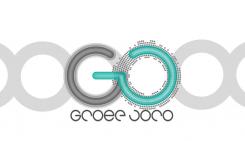
sorry for the bad orthography of "Groep".
Please tell me if you prefer this version of the logo.
I don't understand very well what you want exactly with the J and the R. To my mind, the J stick with the R look better than the J without the R.
But, if you prefer like this it's your decision.
Thanks for your comment. Have a good day!
I need a new corporate design, a new look for my company "Groep JoRo" an insurance broker and bank
- Contest holder: groepjoro
- Category: Stationery design
- Status: Ended
Start date: 11-11-2012
Ending date: 30-11-2012
Total budget: € 199.00
Latest design
It all started with an idea...
A short, interactive guide helped them discover their design style and clearly captured what they needed.
Brandsupply is a platform where creative professionals and businesses collaborate on unique projects and designs.
Clients looking for a new logo or brand identity describe what they need. Designers can then participate in the project via Brandsupply by submitting one or more designs. In the end, the client chooses the design they like best.
Costs vary depending on the type of project — from €169 for a business or project name to €539 for a complete website. The client decides how much they want to pay for the entire project.
Designer:
 GaetanBosloup

This contest is finished. Its not possible to reply anymore.
No comments
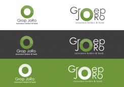
Kan je in het linkse ontwerp Groep plaatsen ipv Grop en in het rechtse de r en j lossen van elkaar?
This contest is finished. Its not possible to reply anymore.