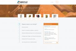
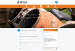
I have created the more obvious link to the webshop. I can always replace the visual pictures with the icons. But I think it's good to give the front page a more visual approach and the other pages a menu bar at the top of the page just like my previous design.
I would like to hear your opinion.
Frank
New grafic design homepage www.rentair.be
- Contest holder: Rentair
- Category: Webpage design
- Status: Ended
Start date: 01-04-2014
Ending date: 17-04-2014
It all started with an idea...
A short, interactive guide helped them discover their design style and clearly captured what they needed.
Brandsupply is a platform where creative professionals and businesses collaborate on unique projects and designs.
Clients looking for a new logo or brand identity describe what they need. Designers can then participate in the project via Brandsupply by submitting one or more designs. In the end, the client chooses the design they like best.
Costs vary depending on the type of project — from €169 for a business or project name to €539 for a complete website. The client decides how much they want to pay for the entire project.
Frank, zeker "less is more" Ik check dit design even met mijn zakenpartner... Frans
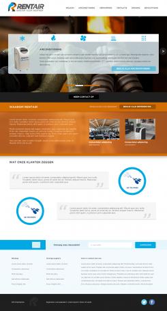
Hierbij mijn eerste ontwerp voor een homepagina. Ik kan alle aanpassingen uitvoeren.
Frank
Like your design. However, am looking more at a design such as www.ictrent.nl ...especially like the fact that pictures of the products can be used as call to action buttons to the webshop. What I am missing in your design is the intuitive link to the webshop...does that make any sence to you?
Thankyou for responding to my design. If I understand everything correctly you say that you want more focus on the webshop. So my idea is to replace the part under the banner with the Call to Action buttons. So your eye focusses on the Pictures which creates a more open link to the webshop.
I would like to hear your opion on that.
Frank
ok, that would be great...visual representation of the product groups below the banner including a call to action to the webshop at each product image. Product groups are: airco, droging, verwarming, ventilatie, ontvochtiging. Yes, the eye should focus on the images and the call to actions. Text on the call to actions could be: "huur droger" for example. I am really looking for a homepage where the customer immediately knows intuitively what to do..which is the case with www.ictrent.nl for example, but that homepage design I would like to have improved/modified (should be even better...)
 Nederland
 België
 France
 Deutschland
 Österreich
 United Kingdom


