Freshen up existing design of logo and website for female IT freelancer
Contest details:
Bronze
- Contest holder: mlmdegroot
- Category: Webpage design
- Total budget: € 299.00
- Start date : 25-03-2013 16:33
- Ending date : 08-04-2013 16:30
- Status : Ended
- Required formats: jpg,psd,ai,
- Relevant files: None
- Available languages:
- Number of designs: 18
-
Response rate:
low high
Needs:
Company description:
Pick my Brain specializes in designing software on a functional level, for offshore development. Because programmers and clients are in a different country, the demand for clear software specifications is even stronger. Furthermore, attention to the communication is important, because of differences in location, time and culture. Pick my Brain discusses with the client what his ideas are, translates these into clear software specifications for the programmer and makes sure the programmer thoroughly understands what is needed. On delivery the client is trained in using the delivered software or website.
Target group:
My direct clients are usually software companies with developers abroad. It could also be design agencies that outsource web development, or end clients.
Colors, favourites and other requirements
(See attached files and current website: www.pickmybrain.eu)
Logo and style:
I'd like to keep the color pink (#C91F82), the font used for the name (Moolboran) and the idea of the arrow (connecting the parties involved to move forward together), although the arrow design can be a bit different. I like the combination of pink with dark grey (e.g. #1A1A1A), and currently used secondary colors are blue (#1B1389) and green (#578E23). These can be changed. I like a feminine touch, but it has to give a professional impression. I like the concept of a pattern with the logo (see business card), but the current one is a bit too cheerful to use on bigger surfaces. To add some organic shapes, I would like to do something with the China blossom.
Website:
The website currently has the layout of the Functional Design documents that I make: Large image area on the left, explanation on the right, with letters indicating what the explanation is about. I like the setup, but it's not perfect yet. The footer could be more involved in the design.
ministudio
-
-
No comments
-
This contest is finished. Its not possible to reply anymore.
-
-
-
No comments
-
This contest is finished. Its not possible to reply anymore.
-
-
-
No comments
-
This contest is finished. Its not possible to reply anymore.
-
-
-
Description by designer ministudio:
If you like the work, i can give you more option.
-
mlmdegroot says :
Hi Ministudio,
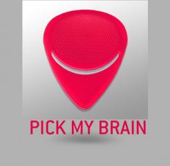
Thanks for your designs. I see that you have chosen for a very different approach (font, color, icon). Can you explain what the idea behind the plectrum shape is? Currently the shape is very much separate from the name. I like it how it becomes a flower or butterfly at the top left of the name in the other two designs. Still it could be more of a unity.
Regards,
Marion -
This contest is finished. Its not possible to reply anymore.
-