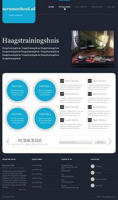
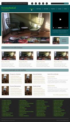
new design conceived according to the approaches of propositions
thank you for telling me if it suits you !!?
Design website template for new training institute in The Hague
- Contest holder: Jobien
- Category: Website design
- Status: Ended
- Files: File 1, File 2, File 3
Start date: 02-10-2018
Ending date: 09-10-2018
It all started with an idea...
A short, interactive guide helped them discover their design style and clearly captured what they needed.
Brandsupply is a platform where creative professionals and businesses collaborate on unique projects and designs.
Clients looking for a new logo or brand identity describe what they need. Designers can then participate in the project via Brandsupply by submitting one or more designs. In the end, the client chooses the design they like best.
Costs vary depending on the type of project — from €169 for a business or project name to €539 for a complete website. The client decides how much they want to pay for the entire project.
1) I rearrange the menu so that it is always there even when it is a mobile phone that consults the site.
2) I also rearrange the image when we come to the site, images that scroll
3) I redispose the block of brief introduction then the two parts which speaks of scrum master and Product owner training.
4) I add some customer testimonials that can lead visitors to more trust and just after a button to join you, I think it's quite effective!
5) some words and pictures and finally the footer (I remove links for social networks) !!!!
for the effect that is found on the site you told me about it is in the code developing that we can implement that! with CSS or JAVASCRIPT. so for that there are no worries !!!!
here https://jungleminds.nl/?gclid=Cj0KCQjw0dHdBRDEARIsAHjZYYA0IRELNNb3wkuNULIvMLuBlKi4K3-yZPwHoZaF8ZK5NxsxlxlG9znIaAmU
it's video that's there !! if you want we can put video too, it's up to you !!!
No comments
I like the boldness of the pink/red colour and the contrast, it may already be shown once you land. Look at https://web.archive.org/web/20161115120725/https://jungleminds.nl/ to see what I mean.
I would like to have moving image on the landing page, does the design allow for that? https://jungleminds.nl/?gclid=Cj0KCQjw0dHdBRDEARIsAHjZYYA0IRELdNNb3wkuNULIvMLuBlKi4K3-yZPwHoZaF8ZK5NxsxlG9znIaAmUsEALw_wcB
I like the big buttons 03 trending, 02 New ideas and 01 awesome design. It makes me want to click them.
The design now highlights the trainers, but I actually think the Scrum Master and Product owner training should be central in order to increase the conversion. After a brief introduction I would like to highlight the two trainings (with each short description, dates and read more button).
We will not prominently link to twitter, facebook, linkedin and g+
I would like the menu to stick to the top as you scroll down
The training institute is about personal connection and becoming part of a group, so I am hesitant towards using a laptop
For now, I do not see the format adapting.
I like the loops at the end.
Sorry, it seemed not to work.
This design is less outspoken
This design is less outspoken
ok
No comments
So are we going to leave based on this design? Okay? and I am going to add your remarks and improve it as you go along. all your constraints or your remarks are possible and the template or the design allows it, I can implement it to you !!!
thank you
the site that I conceive is responsive therefore adapts well to mobile! you want the design to look like this site https://jungleminds.nl/?gclid=Cj0KCQjw0dHdBRDEARIsAHjZYYA0IRELNNb3wkuNULIvMLuBlKi4K3-yZPwHoZaF8ZK5NxsxlxlG9znIaAmU?
the site that I conceive is responsive therefore adapts well to mobile! you want the design to look like this site https://jungleminds.nl/?gclid=Cj0KCQjw0dHdBRDEARIsAHjZYYA0IRELNNb3wkuNULIvMLuBlKi4K3-yZPwHoZaF8ZK5NxsxlxlG9znIaAmU?
tell me that you like a testimony block?
Hallo, mijn naam is Sem webdesigner en ontwikkelaar, dit is mijn eerste voorstel en ik sta open voor eventuele wijzigingen. Ik kan de site ontwikkelen en zelfs een beveiligde verbinding met de site maken sinds ik hem doorblader. Ik zie dat er veel openheid is.
Dankjewel
 Nederland
 België
 France
 Deutschland
 Österreich
 United Kingdom


