No comments
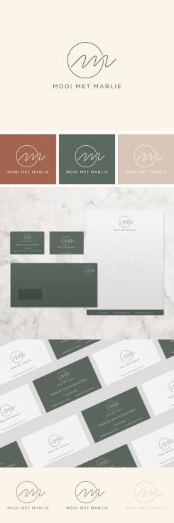
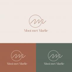
Elegant corporate identity and logo for a beauty salon
- Contest holder: Marlie van Nijnatten
- Category: Website design
- Status: Ended
- Files: File 1
Start date: 08-12-2019
Ending date: 22-12-2019
It all started with an idea...
A short, interactive guide helped them discover their design style and clearly captured what they needed.
Brandsupply is a platform where creative professionals and businesses collaborate on unique projects and designs.
Clients looking for a new logo or brand identity describe what they need. Designers can then participate in the project via Brandsupply by submitting one or more designs. In the end, the client chooses the design they like best.
Costs vary depending on the type of project — from €169 for a business or project name to €539 for a complete website. The client decides how much they want to pay for the entire project.
Really beautiful!
This is a lot more feminine! I love it!!
No comments
This looks really good! I have some other questions. Can I send you a email?
No comments
Gorgeous!
Is that Perfect ?
Pretty sure! :) You fully understand my wish! It is getting closer to the perfect logo!
I'm really curious about what other creative ideas you have to design a chic and elegant house style and logo :) Can you use one of the graphic illustrations from my moodboard?
No comments
Almost perfect! Would it be nice to add a small graphic accent like in my third download file?
You mean eye in the hand?
Yes.. Eyelashes in the hand ;)
Now i understand what are you looking for. Just wait for my new design.
No comments
Hi,
thank you for designing this logo .. i really like the logo itself! I also find the color choice excellent. I like to see this reflected in a house style. I would like to see the text under the logo in a slightly more minimalistic font. And maybe some more graphic accents in the same style as the logo. That would be perfect!
I will first fully wait for the competition to give other designers the chance, but this is already a very good start!
Lots of love,
Marlie
 Nederland
 België
 France
 Deutschland
 Österreich
 United Kingdom
