 Nederland
 België
 France
 Deutschland
 Österreich
 United Kingdom
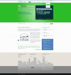
I changed Home Page like you ask, I add footer from 1 and the header from 2.
New Global Home Services Platform Website Design
- Contest holder: geert.berkvens
- Category: Website design
- Status: Ended
- Files: File 1, File 2
Start date: 21-08-2012
Ending date: 28-08-2012
Total budget: € 499.00
Latest design
It all started with an idea...
A short, interactive guide helped them discover their design style and clearly captured what they needed.
Brandsupply is a platform where creative professionals and businesses collaborate on unique projects and designs.
Clients looking for a new logo or brand identity describe what they need. Designers can then participate in the project via Brandsupply by submitting one or more designs. In the end, the client chooses the design they like best.
Costs vary depending on the type of project — from €169 for a business or project name to €539 for a complete website. The client decides how much they want to pay for the entire project.
Designer:
 ziva
ziva
This contest is finished. Its not possible to reply anymore.
No comments
For the modern, fluid / responsive pages
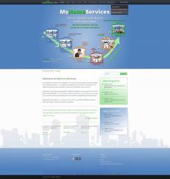
I Like the footer with the city in the with area. The header is to crowdy needs simple, modern prof. look
This contest is finished. Its not possible to reply anymore.
No comments
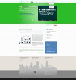
Green header
I like the green header, it is better than the bleu one.In combination with the footer from the first one.
This contest is finished. Its not possible to reply anymore.
No comments
For the start, I set up two proposals for the Home Page. The first proposal is a "classic" corporate design. It is presented by pages which header is dominated by green or blue colour.
The second proposal is more liberal, for the modern, fluid / responsive pages (I noticed that the test site is fluid / responsive). The dominant colour is blue.
The basis of these proposals (Grid-based layouts) is a 960px grid system with 12 Colon. (12 column grid).
If I had the original files (PSD, EPS vector graphic ...) some details could be done better.
I'd like to know your opinion as soon as possible so that I'll know how to go on. I'm interested in how many pages you need because the desighn for the most pages will be the same or similar, and it will change only the content, mainly.
I like the footer from 1 and the header from 2
This contest is finished. Its not possible to reply anymore.