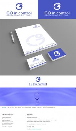
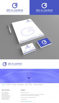
Thank you for the typo information ;) Attached the version with the splittings you mentioned, and the typo Philosopher. For any further improvements I'll be at your disposal, kind regards, Dagmar Lange
GO in control - Logo, business card and webbanner
- Contest holder: GO in control
- Category: Logo design
- Status: Ended
Start date: 23-01-2016
Ending date: 09-02-2016
It all started with an idea...
A short, interactive guide helped them discover their design style and clearly captured what they needed.
Brandsupply is a platform where creative professionals and businesses collaborate on unique projects and designs.
Clients looking for a new logo or brand identity describe what they need. Designers can then participate in the project via Brandsupply by submitting one or more designs. In the end, the client chooses the design they like best.
Costs vary depending on the type of project — from €169 for a business or project name to €539 for a complete website. The client decides how much they want to pay for the entire project.
Tnx again. I just saw it mentions 'partners'; should be 'partner'. Minor issue, can be resolved later. For now it looks very nice.
Good morning GO in control,
thank you for your positive rating. Attached a revision with a better readable head- and subline and a first layout for an according housestyle and a web banner. Looking forward to your reply, kind regards, Dagmar Lange
Tnx again. It's a nice and clean design this way, i like it. I'm doubting if the G could get some extra dynamics splitting it into 2 maybe 3? Not sure if that will work though.
Is it possible to use the same font as used on my website? Tnx.
The fontfamily is Philosopher, tnx.
No comments
Nice color. The bottom line could be more present (just blue/white only? Interesting design
No comments
I like the other version with the full O better
Thank you for your feedback & rating, attached two versions in sapphire blue & green color combination. Kind regards, Dagmar Lange
Tnx. Still looks a bit too busy to me
 Nederland
 België
 France
 Deutschland
 Österreich
 United Kingdom


