No comments
Create an inspiring logo for Imagine
- Contest holder: Ymagine
- Category: Logo design
- Status: Ended
- Files: File 1, File 2, File 3
Start date: 12-09-2018
Ending date: 03-10-2018
It all started with an idea...
A short, interactive guide helped them discover their design style and clearly captured what they needed.
Brandsupply is a platform where creative professionals and businesses collaborate on unique projects and designs.
Clients looking for a new logo or brand identity describe what they need. Designers can then participate in the project via Brandsupply by submitting one or more designs. In the end, the client chooses the design they like best.
Costs vary depending on the type of project — from €169 for a business or project name to €539 for a complete website. The client decides how much they want to pay for the entire project.
No comments
Hi Wilko, Thanks for these adjustments!
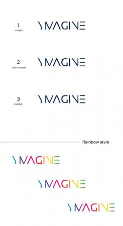
I most like version 3 rounded!
I need to contemplate on the 1 color or multicolor version. Just checked it with a simple printer and both come out fine.
Any advice how you suggest this to work on collateral like business cards and letters?
Hi,
Ok for the rounded version, maybe it is softer and with more proximity.
Concerning the branding style, I think we can play with the letters as I did in a previous design. If you want we can discuss about that after the contest. I will give you my email and explain how we can work on your branding.
No comments
Dear Wilko,
I prefer version 2. My last few requests for final optimization are:
- could you fill the round space of the G?
- have the middle stripe of the E equally long as the top and bottom stripes of that E
- what if the end of the letters would be more rounded (like Vag round). Would that give an overall friendlier/softer feel to this professional looking logo?
I’m doubting on the colors, on one hand I think it’s cheerful, but just plain is more practical. What would you recommend with regards to stationary?
Ok, I will show you the different versions.
Concerning the stationary and the color, I think it's good having some colors. We have more design possibilities. However, you can adjust and change the colors depending the media.
Hello,
I just saw the ambigram design so I made on too.
I warn you that some ambigrams exposed on the contests are made by a generator: https://flipscript.com
Mine too, nothing complicated.
Personally, I do not think ambigram is a good thing for small-scale readability.
But it's up to you !
Thanks for mentioning the generator! (Less original then)!
And you may be right on small(er) print and readability of Ambigrams
Hey,
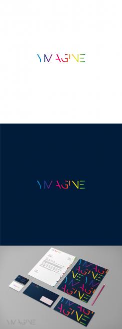
Here is an example of stationery with the thicker logo you preferred and with the rainbow style.
No comments
Thanks for showing all these color options.
Although I currently evaluate all proposals merely on design, the rainbow version on white does add lightheartedness and optimism, making it a bit less serious and corporate. Although open to styled, slick and cheerful this one remains a favorite.
Hello Mascha,
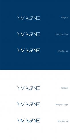
Here is 3 designs thicker with differents weight.
Still the blue version but différent colors come in the next proposal.
What do you think about it?
I prefer the thickest version (it comes across as most “confident”.
No comments
de bovenste 2 vind ik erg mooi qua stijl. (De anderen wat rommeliger).
Dank voor het tonen in een andere kleur. Het laat zien dat je eerste met donkerblauw toch wel echt krachtiger overkomt. De stijl van deze manier van schrijven van Ymagine is een van mijn favorieten! Denk je dat het zelfverzekerder over komt als de letters ietsje dikker zouden zijn of boet dat juist in op de stijl?
Hello,
Thank you for your excellent rating. I'm glad you like my job.
Indeed, I think that the blue version is more powerful and more classy.
In my opinion, enlarging the letters will remove the lightness of the logo.
Regarding the colors. What preferences do you have?
For information, I will not be in the office until Tuesday. I will rework your logo at this time.
I will make examples of business cards and letterhead.
Thanks again.
Cordially.
No comments
Hi Wilko,
Even more high-tech feel to this one. See my comment on your other proposal.
Regards, Mascha
No comments
Hi Wilko, From all your proposals I like this one best.
The dark blue used is beautiful but feels a bit high-tech to me. Whereas we're in a business where people are the center point to make things happen
Hello,
Here is my work for your new brand identity. You can see the files in good quality by clicking on the images.
I tried to bring my experience in graphic design to create a powerful and distinctive logo. I hope you will enjoy my work as much as I enjoyed working on your project.
I await your feedback and I remain at your disposal.
Best regards
WILKO
 Nederland
 België
 France
 Deutschland
 Österreich
 United Kingdom
