No comments
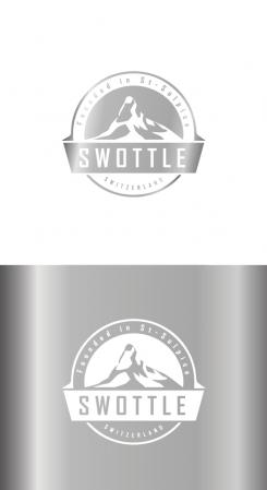
Design a fresh & modern logo for a Swiss Consumer Goods Company
- Contest holder: dianusska
- Category: Logo design
- Status: Ended
- Files: File 1
Start date: 19-07-2016
Ending date: 02-08-2016
It all started with an idea...
A short, interactive guide helped them discover their design style and clearly captured what they needed.
Brandsupply is a platform where creative professionals and businesses collaborate on unique projects and designs.
Clients looking for a new logo or brand identity describe what they need. Designers can then participate in the project via Brandsupply by submitting one or more designs. In the end, the client chooses the design they like best.
Costs vary depending on the type of project — from €169 for a business or project name to €539 for a complete website. The client decides how much they want to pay for the entire project.
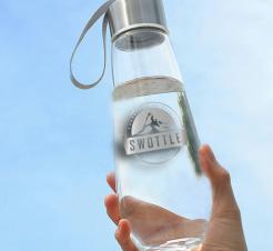
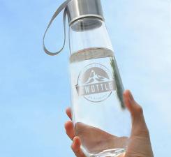
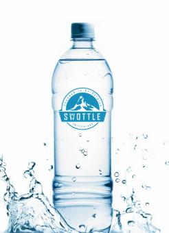
very nice this design :) Many thanks for the rework. Nice integration on the bottles as well. I wanted to ask for your feedback on printing this on glass bottles - do you think there is anything we can do on the font to further highlight the small details (shadow, outline, etc)?
Hello still our favorite this one. Only question I have is if you think it's possible to bring out the Matterhorn mountain any more recognizable? I saw some other designs that were submitted where it is more recognizable? What do you think?
I think it will become less logo-like to copy the exact example you gave. Kind regards.
With effects it become's like this. kind regards.
No comments
Hi Dania, is this what you mean? Kind regards
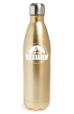
Hello and many thanks. I actually prefer the previous font :) The logo in white & silver looks very nice and premium - to keep :) Would you mind reverting to the old font and also place it on a gold bottle (same shape as the silver one you used) and on a glass bottle (https://partnergroup.en.alibaba.com/product/60435926929-802850054/BPA_free_Kids_school_water_bottle_350ml_with_straw_lid.html)?
No comments
Hello and thanks for the proposal.
Could you please illustrate the following for us:
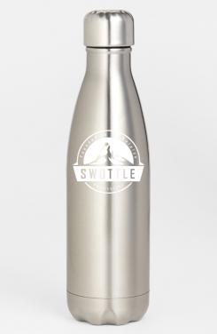
- how would you see this logo integrated on a metal bottle (colors) such as http://shop.nordstrom.com/s/swell-sparkling-champagne-stainless-steel-water-bottle/4048102?origin=keywordsearch-personalizedsort&fashioncolor=GOLD (only for illustration purposes obviously)
- would you mind giving it a try with some other fonts / colors for the company name?
Many thanks
 Nederland
 België
 France
 Deutschland
 Österreich
 United Kingdom
