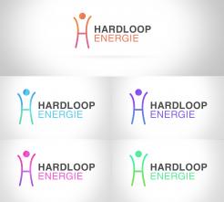
PFA colour options.
Design a logo for a new concept: Hardloopenergie (Running energy)
- Contest holder: marklinde
- Category: Logo design
- Status: Ended
Start date: 14-12-2018
Ending date: 21-12-2018
It all started with an idea...
A short, interactive guide helped them discover their design style and clearly captured what they needed.
Brandsupply is a platform where creative professionals and businesses collaborate on unique projects and designs.
Clients looking for a new logo or brand identity describe what they need. Designers can then participate in the project via Brandsupply by submitting one or more designs. In the end, the client chooses the design they like best.
Costs vary depending on the type of project — from €169 for a business or project name to €539 for a complete website. The client decides how much they want to pay for the entire project.
please check updated logo in blue.
Ha Vikas,
I like this one better then the upper one.
I have added 2 links in the briefing for some color inspiration. Im just not sure yet about the color settings as is. Could you have a look at it and try a few things with different colors? If you feel like trying something with the gradient as in your first design, feel free.
I hope you can give it a try. Would help me a lot!
if you have any questions, let me know!
Hello,
As per your suggestion I have made some amends in design. Please check updated logo and let me know your feedback.
Thank you
Hi Vikas,
thanks for your amends.
The yin/yang thing was a bad idea :)
- how about the H in one color (would like to see both colors) and the head also in one color ?
- Than alternatively this design, but the head with the split up that you had in earlier designs (than this blue and green)
would be cool if you could play a bit with it! I'm also curious to your own preferences!
good luck!
Mark
No comments
Hi Vikas,
I like your idea!
I would like to try some things out:
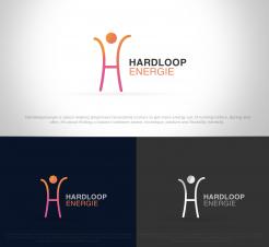
- I find the orange/pink/red colors a bit to happy, therefore I like the grey one on the dark grey background the best sofar.
- Is it possbile to make the arms a tiny bit shorter? So the H is a bit les gracious. Just have a look if that would make it better
- could it work if the H would be more in a green/blue color (like on my website; www.hardloopenergie.nl )?
- I like it that there is happy energy in the logo, but at the same time the energy is about balance , just something to try out ; would a very fine yin/yang (without the dots) in the 'head' work? Or would there be a other way to get this kind of yoga energy in there?
Im really glad that there is happy energy in the logo! I hope you can make some refinement steps to improve it !
If you have any questions, let me know.
 Nederland
 België
 France
 Deutschland
 Österreich
 United Kingdom


