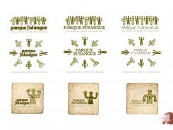
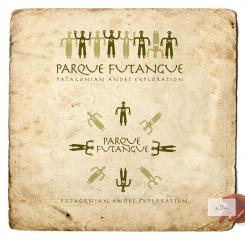
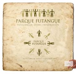
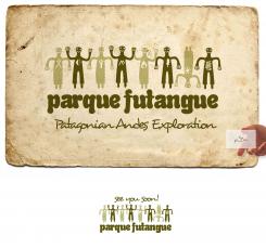
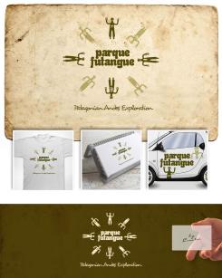
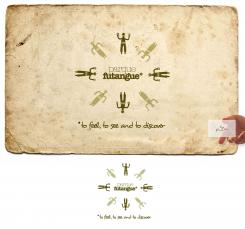
I gave the "pillans" more character. 3 type versions. I wish you luck ;-)
Design a logo for a unique nature park in Chilean Patagonia. The name is Parque Futangue
- Contest holder: matiasrt
- Category: Logo design
- Status: Ended
Start date: 11-06-2013
Ending date: 10-07-2013
It all started with an idea...
A short, interactive guide helped them discover their design style and clearly captured what they needed.
Brandsupply is a platform where creative professionals and businesses collaborate on unique projects and designs.
Clients looking for a new logo or brand identity describe what they need. Designers can then participate in the project via Brandsupply by submitting one or more designs. In the end, the client chooses the design they like best.
Costs vary depending on the type of project — from €169 for a business or project name to €539 for a complete website. The client decides how much they want to pay for the entire project.
thanks!!
Hi Ted !,
For the moment , i like the typography in the left side, with the arrangement you made to the letter "U".The slogan is ok that way.
I would like you to display the gods the same way you draw them before in your previous submission (I dont know yet which of these with "character" i prefer, so just keep the old ones and have this new as an option.
Finally, i want to have the two versions, the round one and the gods on a line.
sorry !! i mean the typography in the right side
Hi Matías,
Thank you! Offcourse You will get what you want :-) on a line, round. And with The characters you like, or think would be best representive for your parc. Nice! Have some nice days, we keep in touch.
Salud,
Ted
No comments
Hi Ted,
In the logo with the gods on a line i prefer if you turn the one with the head down.
The themes are ok.
I´m ok with this typography but i would like you to change a little bit the letter "Q" and the letter "U" to make them more readable and easy to notice. I´m afraid that someone confuse the "U" with a "V" or doesnt undersatand the "Q".
Finally, what if you try with different typography for "Patagonian Andes Exploration" to avoid abusing of just one type.
another small detail: the god with the moon should have her arms up, and in the round logo the god with the sun should be the one at the top
I still would like to see the advert typography as well
Hola Matías,
My updates.
Buenos Dias (Nuchos a qui)
Ok cool , I will ask for a second opinion. In the meantime is it possible to see the logo with the ADVERT typography or another one similar? thanks
No comments
Hi Matías
This proposal is with the Advert type...
Hola Matías,
My update. Looking forward...
Saludos,
Ted
Hola Ted. I like the idea of themes, is very good. We will just have to agree on which are the best to put. I´m ok with the sun, the moon, the mountains, and the tree, but the others are not sufficiently clear for me. Let me see if the new typography is ok for the people i work with.
Good job !
can you try with a more mature, sober and elegant typography,one that makes you feel that the park is exclusive
other thing that is worth trying , is to make a curve with park on the top and the same with Futangue in the bottom. I believe you if you think it wont look ok that way
regarding to the themes: the sun must be on a male figure, the moon must be on a female figure. I dont understand the theme on the figure pointing to the northwest, you could use a simple frog on that one. The figure pointing to the south isn´t clear either,you could put something that simbolize fire and finally the one pointing to the southwest, i guessthe theme represents a person, maybe you could put it like a hiker or just use the band on the chest like in the original figure.
Hi Matías,,
From left to Right: vulcano, moon with stars, frog hand, mountain, fire, leaf, sun and last 'river'. Offcourse minor changes can be made... for now i think its enough. Unfortunatly for me you made my idea public by making it an logo requirement... so i lost my 'advantage'. I understand from your point of view. Obvious. I will make it just The way you want it if you like it that much. Now i wait and see...
Salud,
Ted
No comments
Hi, interesting logo !!. Give me your email to send you the image I need in the logo, you will just have to do a cool adaptation, and you wont have to spend time with the concept , i got it already. By the way the slogan would be " Patagonian Andes Exploration".
Thanks for participating !!
hey, this one is definitely an option with minor arrangements. I just need you to explore some other options, that´s why i need to send you some images!
Thank you! I'll send you my mailadres in the direct system.
Hi Ted,
Can I see this one with different typography and with the slogan "Patagonian Andes Exploration"
 Nederland
 België
 France
 Deutschland
 Österreich
 United Kingdom
