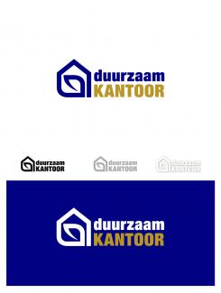
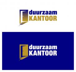
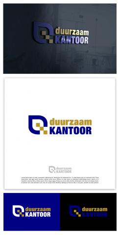
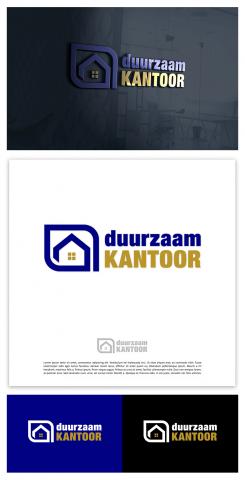
Okay, there is something to discuss here, but for the sake of continuing good cooperation, I will not discuss it further. I am ready for a compromise solution. I will post three new design variants. I can't give up on developing my basic idea HOUSE, (sustainable office) + a tree leaf stylized in my own way as a symbol of self-sufficiency. The client liked my solution and that must be taken into account. I will do my best to change the final look of my design enough so that it is no longer controversial.I hope you like one of the three new logos. There are also font variants that you have been looking for. I also inserted the slogans you wanted. The words DUURZAAM KANTOOR are too long to be in one line. The final logo thus loses its harmonious proportion. I tried to solve it this way.
Design a logo for our new company ’Duurzaam kantoor be’ sustainable office
- Contest holder: indra.vandeven
- Category: Logo design
- Status: Ended
- Files: File 1
Start date: 13-11-2020
Ending date: 07-12-2020
It all started with an idea...
A short, interactive guide helped them discover their design style and clearly captured what they needed.
Brandsupply is a platform where creative professionals and businesses collaborate on unique projects and designs.
Clients looking for a new logo or brand identity describe what they need. Designers can then participate in the project via Brandsupply by submitting one or more designs. In the end, the client chooses the design they like best.
Costs vary depending on the type of project — from €169 for a business or project name to €539 for a complete website. The client decides how much they want to pay for the entire project.
Demonstration of the development of my idea HOUSE-SUSTAINABLE OFFICE + SHEET (ecological symbol of sustainability). There was no talk of SPAJALICA which had already been used by a colleague. Pictures 0,1,2,3 are the elaboration and logical development of my basic idea where it is nice to see that the essence of the idea is HOUSE and stylized SHEET inside the house. A colleague put the sheet out to emphasize the paper clip as his basic idea. The following pictures just show that all I had in mind all the time was the house and not the paper clip. Figure 3, which really resembles a paper clip, is disputable, but I thought that the HOUSE-SUSTAINABLE OFFICE and the ecological SHEET inside the house are different enough from the paper clip. I would be glad if a colleague would accept my arguments and resolve this embarrassing situation in a positive way. Best regards, Umbra
SPAJALICA=paperclip
 Nederland
 België
 France
 Deutschland
 Österreich
 United Kingdom


