Dear Alex,
thank you so much!
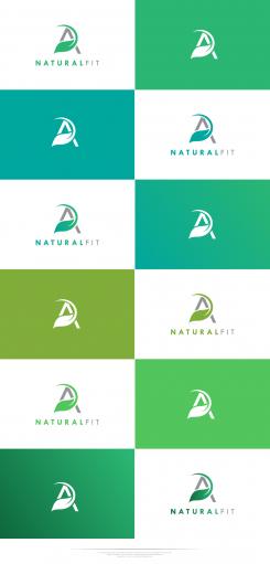
Here is some colour examples.
Hope you will find the one which fits you the best.
Creative regards,
Marko.
Design a simple, eye-catching, memorable logo for health/fitness business
- Contest holder: alexjj80
- Category: Logo design
- Status: Ended
- Files: File 1, File 2, File 3
Start date: 29-12-2017
Ending date: 05-01-2018
It all started with an idea...
A short, interactive guide helped them discover their design style and clearly captured what they needed.
Brandsupply is a platform where creative professionals and businesses collaborate on unique projects and designs.
Clients looking for a new logo or brand identity describe what they need. Designers can then participate in the project via Brandsupply by submitting one or more designs. In the end, the client chooses the design they like best.
Costs vary depending on the type of project — from €169 for a business or project name to €539 for a complete website. The client decides how much they want to pay for the entire project.
Dear Alex J,
here is my vision about your contest.
Here is eye catching monogram with leaf (which represents health) in one "growing up" and unique way.
If you look better, there are the abstract person here showed in movement which represents a health, sport, training...
I really hope that you like this full preview logo in both versions (centred and landscaped).
If you have some suggestions, please feel free to contact me.
Happy and healthy start of New year,
Marko
m3kdesign.wix.com/portfolio
This is fantastic, we're getting close to what I want. Let me think about this for a bit and see if this would work or if I need to change it at all.
Could we maybe try some different greens? It still needs to feel elegant and contemporary though, which this definitely does.
Thank you so much.
I just uploaded a some colour examples.
Hope that you will find the best one.
Regards,
Marko.
 Nederland
 België
 France
 Deutschland
 Österreich
 United Kingdom

