No comments
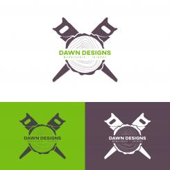
Fresh clean logo for a female entrepreneur starting up a company in Joinery
- Contest holder: TDCrook
- Category: Logo design
- Status: Ended
Start date: 27-11-2020
Ending date: 18-12-2020
It all started with an idea...
A short, interactive guide helped them discover their design style and clearly captured what they needed.
Brandsupply is a platform where creative professionals and businesses collaborate on unique projects and designs.
Clients looking for a new logo or brand identity describe what they need. Designers can then participate in the project via Brandsupply by submitting one or more designs. In the end, the client chooses the design they like best.
Costs vary depending on the type of project — from €169 for a business or project name to €539 for a complete website. The client decides how much they want to pay for the entire project.
Hi,
here is the color revision that you've asked for.
(Aubergine and Grey reversed). I also included the preview of the logo on the brochure and business card.
I hope you'll like it,
Best,
Wira
Hey!
Thank you so much, it's wonderful :D Super happy.
When it is time to share the files in a few days, will they also include the font? I did not verify this in my request, but I can only assume it's normal to include this too?
Hi, I'm sorry for the late response.
about the font, yes, since this font has a free license, I will include this font for you.
Also if you want to do small revision with this font, I will do it for you, free of charge of course.
Also if you are interested in getting more design from me, like business card, brochure, packaging or web design, feel free to contact me directly to my mail (designedbywira@gmail.com), I will surely give you a better deal for you.
best,
Wira
Hi,
Thank you for choosing my design,
here are my latest design.
according to Brandsupply rule, I only able to send you 2 more upload before I hit the limit.
that's why I will upload the design with more variety of color included, I hope you'll like it,
Best,
Wira
Hey :)
The designer always knows best...I think I may be opting for the original one...but I would like to see the Aubergine and Grey with the colours reversed? So Dawn Designs is written in the aubergine and the grey is the saw? I am pretty sure if this option is not right, I will go with the previous one..marked with 5 stars to confirm. I hope it's ok to make this last change?
A little extra question, are the words Menuiserie and Joinery centered with the saw? It may just be an illusion with the saw teeth.
Kind regards,
DD
Hi, here are the latest revision that you've asked, I hope you'd like it.
Best,
Wira
Hey,
Also love it, but the one image is lost (green background and previously the orange background). Could you try a combination of the previous grey background (same grey as on previous "orange" version as this really works well) and pair it up with the purple? You can change the shade of purple if you want to make it fit, but I think it would go well as is. If not, darken the purple just a little. Look at the shade that was used on the very first submission for my logo. Those shades or similar.
I hope that's clear, if not, let me know :D
So in short; grey, purple and white. I do love the orange, and the green but perhaps we should stay simple to ensure the 3 colour ways work well.
Hi I'm sorry for the late reply, I'm really busy this past 2 days, I'm sorry that I can't give you the revision that you've asked before the deadline.
If you still want it I can mail you the new design revision.
Best, Wira
Hi Wira,
I am a little confused by the site now, but I have extended the opening for another week, but this is to discuss with you further the design. I hope it will be clear for others I will not accept their offers.
I've just updated the logo request to mention that a winner has been selected, and I hope that over the next few days we can organise the final design together.
Kind regards,
DD
I cannot comment on the other message for some reason;
Hey :)
The designer always knows best...I think I may be opting for the original one...but I would like to see the Aubergine and Grey with the colours reversed? So Dawn Designs is written in the aubergine and the grey is the saw? I am pretty sure if this option is not right, I will go with the previous one..marked with 5 stars to confirm. I hope it's ok to make this last change?
A little extra question, are the words Menuiserie and Joinery centered with the saw? It may just be an illusion with the saw teeth.
Kind regards,
DD
Hi. I just want to let you know that all the files needed are ready to be send to you. I Just need you to select the design that you want, and I will send the files right away,
Best
Wira
No comments
hi, thanks for the clear feedback, what do you think about this one ?
Hey,
Appreciate seeing the change so quickly, thanks a lot!
This is looking awesome. Could I see it with a purple/aubergine instead of the orange? Also, just a minor detail...the contours that are shown on the under side, could they be adjusted as the lines are too spaced out creating an awkward open space.
Kind regards,
DD
Hi, I'm glad you like it, I'll do it right away
No comments
Hey!
This is nice. I don't like the 2 hand saws, perhaps the contours underneath could be duplicated on the top? I like balance/symmetry.
Kind regards,
DD
hi this is yet another version for the circular saw.
I make sure to keep the proportion, make it as balance as possible and make it less simple.
I hope you'd like it.
best,
Wira
As you've requested I gave revised the last logo,
I hope you'll like it
No comments
Hey!
This design is definately on par with the initial one. Thank you for implementing the changes. It's a contender for sure!
I see you have increased the size of the second row of font, thanks for that, but with this change I feel now we are losing the impact of "Dawn Designs" which needs to be larger.
Kind regards,
DD
No comments
I am spoilt for choice with your designs! :D
This one again, is strong. When I see a large version of it, it looks better than when I see the thumbnail version. The smaller font is lost alongside the contour lines. Maybe it is the colour? The proportions are good.
An idea came to mind; remove contours, slightly increase size of "Dawn Designs" and try the idea of adding a horizontal rectangle with the wood grain/contours? Ok, too many ideas come to mind now, so I will say no more, you are the designer. If this speaks to you, I'd like to see more.
No comments
Love the idea of the 2; saw and tree. As with the design below, it's missing something. Perhaps too simple? Not sure I like the angled font. I definately like symmetry.
No comments
I want to love this one, but it is not quite there. The balance of proportions and simplicity of design ARE fantastic. Perhaps more colour blocking is needed? Or perhaps add the contours/wood grain onto a separate horizontal block/rectangle to create the illusion there is a piece of wood in front of the blade? Just thinking aloud. If it speaks to you, I'd be interested to see a revision.
No comments
This design is also a contender, but right now, it is off balance. With the weight of the handle on the one side, the eye needs something extra on the right side but I cannot put my finger on what could be adjusted/added there. If you have any ideas and feel up for it, see what you can come up with. In the meantime, I will keep thinking too and update you if something comes to mind!
No comments
Hi,
Thanks for your kind feedback, after considering your feedback I decided to use two man hand saw instead of two hand saws to make the logo wider and thinner.
I also have enlarge the font to make it more readable.
best regard,
Wira
Hi,
Thanks for your kind feedback, after considering your feedback I decided to use two man hand saw instead of two hand saws to make the logo wider and thinner.
I also have enlarge the font to make it more readable.
best regard,
Wira
Hey!
Apologies for any delay in my response.
I have to be honest, I am not a fan of the saw you have chosen because for me this suggests I am a lumberjack/exterior carpenter. I really like your original design, it was just the angle I thought could be adjusted (and perhaps I am completely wrong here :D). I did not mean to over complicate my feedback for you. The other point was just increasing the font size for "Menuiserie Joinery".
I will comment above for your other designs...
Kind regards
hi, thanks for your kind reply.
I have revised my first design to suit your liking.
I hope you like it.
Best,
Wira
No comments
Hi Wira_mv!
Many thanks for your submission and time working on this design. I really love the idea of the tree trunk here, and the hand saws work well too. I can definately relate to the design in positive way.
I would like to ask for a few adjustments if you have the chance?
I'd love to see the saws angled downwards a little more so that there is some overlap with the company name? I think it is the feeling of a cross shape that is what I want to change, if they were more horizontal, I like the idea of creating a concaved/convexed edge on the top and bottom, so the logo is wider and thinner?
Additionally, I need the font a little bigger, the "menuiserie / joinery" is lost. The font scales are good though. It needs to pop a little more.
I'd love to see version 2!
Kind regards,
Dawn Designs
 Nederland
 België
 France
 Deutschland
 Österreich
 United Kingdom
