No comments
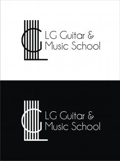
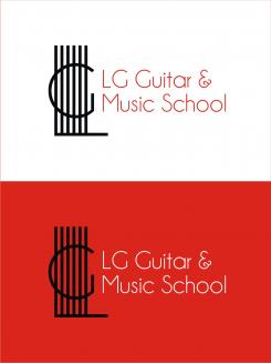
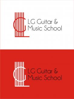
LG Guitar & Music School
- Contest holder: lgguitarschool
- Category: Logo design
- Status: Ended
Start date: 28-03-2015
Ending date: 11-04-2015
It all started with an idea...
A short, interactive guide helped them discover their design style and clearly captured what they needed.
Brandsupply is a platform where creative professionals and businesses collaborate on unique projects and designs.
Clients looking for a new logo or brand identity describe what they need. Designers can then participate in the project via Brandsupply by submitting one or more designs. In the end, the client chooses the design they like best.
Costs vary depending on the type of project — from €169 for a business or project name to €539 for a complete website. The client decides how much they want to pay for the entire project.
No comments
a greeting.
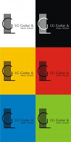
thanks for the suggestions. you can select the background color, the color of the logo, the color of the text.
No comments
a greeting.
corrects the text. I think it's a good relationship of text and logos
No comments
a greeting.
I suggest you a white background. logo positive.
and you can suggest the background color you want
I suggest you letters champagne & limousine. logo was designed by the guy letters.
I set a larger font.
thanks for the suggestions.
Hello again, we liked the logo better when all letters were equally sized. But visibility is a lot better with the bigger letters. We would like also like to keep the "&". Is it possible to make the logo more compact & bigger lettered like LG GUuitar here?
No comments
Hello Steven, thank you. Original and representative for a guitar school. Also took a look at other logos you made. Very nice, you really catch the essence.
Hi Steven, we still like your logo for many reasons. We are wondering if there is a possibility to make this logo a bit more modern (for example by changing the lettertype). We are also curious what this logo does on a different background color (white or something else).
Hi Steven, This is still our preferred logo (the firs one). Could we receive this one in white (black background), black(white background), red (black background). Then we are wondering if a hint of color in the logo itself would be nice? For us hard to imagine if that works or absolutely not....
Larger font was good in later logo. Lettertype of this first one and equal size of the letters had our preference. We would like the logo to be as compact as possible.
Sorry keep writing Steven and not Stevan, PS think we dit not really understand who designed this logo? The guy letters?
 Nederland
 België
 France
 Deutschland
 Österreich
 United Kingdom
