No comments
Logo Evolution36
- Contest holder: Evolution36
- Category: Logo design
- Status: Ended
Start date: 24-10-2017
Ending date: 31-10-2017
It all started with an idea...
A short, interactive guide helped them discover their design style and clearly captured what they needed.
Brandsupply is a platform where creative professionals and businesses collaborate on unique projects and designs.
Clients looking for a new logo or brand identity describe what they need. Designers can then participate in the project via Brandsupply by submitting one or more designs. In the end, the client chooses the design they like best.
Costs vary depending on the type of project — from €169 for a business or project name to €539 for a complete website. The client decides how much they want to pay for the entire project.
No comments
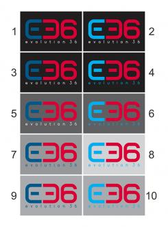
The font for the smaller text has a bit of an odd i, it almost looks like an l. We like the lowercase though. We tried some colours ourselves again, could you maybe try the upper right with a blue E on a light and dark background? Thanks again for the adjustments, it looks awesome.
No comments
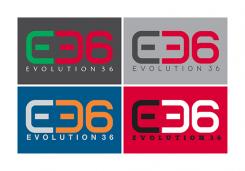
Yeah, these look great! The following colours are our favourites (letter colour, number colour, background colour):
Green, red, dark-gray
Gray, red, light-gray
Light-gray, orange, blue
Black, white, red
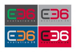
Could you maybe try a different font for the small text underneath the icon? Thanks again!
No comments
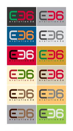
Thanks again, we really like this! We still would like to see some more colours. For example, we tried colour picking ourselves a bit and we thought maybe #d90036/rgb(217,0,54) would be nice. We would also like to see how this logo works on a light background and possibly other applications. This is definitely our current favorite.
Greetings,
Evolution36
No comments
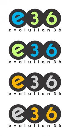
Thanks for this new idea. We have the idea the 3 and 6 are too different. The six is a big belly and the 3 seems a bit slim. Also, the logo-idea leaves a bit of a childish impression to us. We like the recognizability and use of different colours though!
No comments
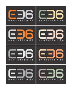
Thanks, this looks pretty cool! So far this might well be our favourite. The E and 3 look a bit like a robot-head, which is actually kinda cool. Don't stress this too much though, because we're no robotics of course :P. Maybe a bit more spacing between the letters helps with readability. The colour distinction between E and 36 helps wit readability, so maybe stress that some more (the orange/gray example is good). We also would like some more colour variations and maybe some bright colours. Thanks again!
Greetings,
Evolution36
 Nederland
 België
 France
 Deutschland
 Österreich
 United Kingdom
