No comments
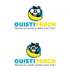
LOGO of a MONKEY who proudly holds a BANANA
- Contest holder: Big Ben Junior
- Category: Logo design
- Status: Ended
Start date: 10-08-2015
Ending date: 31-08-2015
It all started with an idea...
A short, interactive guide helped them discover their design style and clearly captured what they needed.
Brandsupply is a platform where creative professionals and businesses collaborate on unique projects and designs.
Clients looking for a new logo or brand identity describe what they need. Designers can then participate in the project via Brandsupply by submitting one or more designs. In the end, the client chooses the design they like best.
Costs vary depending on the type of project — from €169 for a business or project name to €539 for a complete website. The client decides how much they want to pay for the entire project.
Perfect, thank you ! :)
Could you also give me a version with only the cercle and the monkey (without the name brand and slogan) in order to be able to use my logo without typography ? Thanks !
thanks again for your feedback! I think that this could be a good compromise.
YES, very nice, I like the first one ! I have one last request :) Can you fix his mouth ? It is too high and wide compared to the classic version. Also, could you lower the slogan in relation to the brand name on the second picture ? I want to see the result with a white space between name and slogan, thanks !
Hi!
I made 3 variations on the outline, I think the one on the bottom connects the monkey more with the name, Don't know if you like that, of course it's all a matter of taste :)
grrrrr I like the 3 of them, it's hard to choose !! So it's a good point for you, good work !
I think I prefere the first one as concerning the third one I dont like very much the white outline around his haircut and his tail, but I understand it's inevitable as the outline of the cercle is black.
Thanks again for your feedback, I added an outline on the name.
Sincerely,
Jeroen Kraneveld
Freebirds Grafisch Ontwerp
Great work ! Thank you :) I dont see any way possible to improve it more. This is what i am looking for : a small monkey cute, intelligent, funny and charismatic, well done. However the contest is not over, your monkey is not the only one I like. I invite you to make me new proposals if you have still time in order to increase your chances of success ;)
Wait, I have still a small problem with it, sorry !! ;) I don't think it's fair that the name of the brand is more emphasized that the monkey-logo itselft. I invite you to show me 2 new version :
- The first one with a light outline for the blue circle and a little bit less emphasized outline for the name ?
- The second one, don't add an outline at the blue circle, but just reduce a little bit the emphasized outline for the name.
Thanks !
dont take into consideration my question mark, it is a typing error
Thank you very much for your positive feedback! I've changed a few things, if you have any suggestions please let me know!
Sincerely,
Jeroen Kraneveld
Freebirds Grafisch Ontwerp
ahahah, your monkey is so sweeeet with his big glasses !! :D He has charisma, personality, he makes me laugh, I like it ! Ok, very good work Mr Jeroen. Concerning the font, could you please add a black border to Ouistiteach please ? I would like to see the result, the name should be more emphasized, thank you !
No comments
Thank you for your work freebird. I like the way the logo looks like, good work ! I like colors, blue and yellow are perfect together. The logo is simple as I requested. The monkey is cute and looks like intelligent, and he has a BIG BANANA ! However, you could improve your work by showing me different fonts for the name and the slogan. I dont like the font used for the name because the letters are too thin. I think that for the name, the characters should be a little bit more thick. Also, can you show me an exemple with "ouisti" in blue and "teach" in yellow please ? Concerning the slogan, I dont like the font because it takes efforts to read. I hope you will be able to improve these points, thank you ! Oh, and if you can show me an other version of the logo by replacing the squares glasses with big round glasses which looks nerd, I would love to see the results :)
 Nederland
 België
 France
 Deutschland
 Österreich
 United Kingdom

