No comments
New Silk Road the opposite route!
- Contest holder: carolineruijg
- Category: Logo design
- Status: Ended
Start date: 02-04-2019
Ending date: 16-04-2019
It all started with an idea...
A short, interactive guide helped them discover their design style and clearly captured what they needed.
Brandsupply is a platform where creative professionals and businesses collaborate on unique projects and designs.
Clients looking for a new logo or brand identity describe what they need. Designers can then participate in the project via Brandsupply by submitting one or more designs. In the end, the client chooses the design they like best.
Costs vary depending on the type of project — from €169 for a business or project name to €539 for a complete website. The client decides how much they want to pay for the entire project.
No comments
Hi
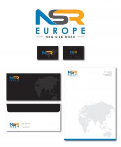
Here is the letterhead / business card for the logo.
Sariaka
No comments
Hi Caroline
Here are the logo with the full name "New Silk Road Europe".
I have made 3 versions of the logo.
i want to know which of them you like before showing you another color.
Sariaka
Dear Sariaka, I am sorry but we had a avote and the majority liked your first logo the best!! So the blue & grey with Europe first then new silk road underneath
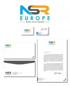
Could you please also make a letterhead / business card? Thanks a lot!! Warm regards, Caroline PS so no need to make new colours
Hi.
Ok. I will work on the letterhead / business card.
Sariaka
Hi Sariaka, is it possible to have your email address? Because we have three websites and more logo's etc to do and it's easier to contact ? Is that possible?
Yes, I have send it to you via private message
Hi Sariaka, is it possible to have your email address? Because we have three websites and more logo's etc to do and it's easier to contact ? Is that possible?
thank you I have not received it yet, please send it to carolineruijg@gmail.com
thanks
In case you didn't receive my email.
My email is : sariakato@gmail.com
Sariaka
No comments
HI Sariaka, thanks for your quick changes. Acutally the full name of the company is New Silk Road Europe; do you think you can add the "New Silk Road" text in between NSR and Europe; so that Europe is at the bottom? Do you have another suggestion? I dont think it looks good if we put 2 x EUROPE . Thanks! I am waiting for feedback regarding the colours. Feel free to make another colour suggestion if you like ;-)
HI Sariaka, thanks for your quick changes. Acutally the full name of the company is New Silk Road Europe; do you think you can add the "New Silk Road" text in between NSR and Europe; so that Europe is at the bottom? Do you have another suggestion? I dont think it looks good if we put 2 x EUROPE . Thanks! I am waiting for feedback regarding the colours. Feel free to make another colour suggestion if you like ;-)
HI Sariaka, thanks for your quick changes. Acutally the full name of the company is New Silk Road Europe; do you think you can add the "New Silk Road" text in between NSR and Europe; so that Europe is at the bottom? Do you have another suggestion? I dont think it looks good if we put 2 x EUROPE . Thanks! I am waiting for feedback regarding the colours. Feel free to make another colour suggestion if you like ;-)
HI Sariaka, thanks for your quick changes. Acutally the full name of the company is New Silk Road Europe; do you think you can add the "New Silk Road" text in between NSR and Europe; so that Europe is at the bottom? Do you have another suggestion? I dont think it looks good if we put 2 x EUROPE . Thanks! I am waiting for feedback regarding the colours. Feel free to make another colour suggestion if you like ;-)
sorry for some reason the post came many times
No comments
Hi Sariaka! Nice to meet you and thank you very much for your designs!! Yours came out as favourite; this version! Do you think you could make the grey a bit more silver colour like and change the blue to red? Just to get some different colour options going...Thanks a lot; I am confident we will make it work together ! Best regards, Caroline
Hi Caroline
Thank you for your feedback.
I have made the changement on the logo. Hope you like it.
Sariaka
HI Sariaka, thanks for your quick changes. Acutally the full name of the company is New Silk Road Europe; do you think you can add the "New Silk Road" text in between NSR and Europe; so that Europe is at the bottom? Do you have another suggestion? I dont think it looks good if we put 2 x EUROPE . Thanks! I am waiting for feedback regarding the colours. Feel free to make another colour suggestion if you like ;-)
HI Sariaka, thanks for your quick changes. Acutally the full name of the company is New Silk Road Europe; do you think you can add the "New Silk Road" text in between NSR and Europe; so that Europe is at the bottom? Do you have another suggestion? I dont think it looks good if we put 2 x EUROPE . Thanks! I am waiting for feedback regarding the colours. Feel free to make another colour suggestion if you like ;-)
 Nederland
 België
 France
 Deutschland
 Österreich
 United Kingdom
