No comments
Wanted: Logo for an Innovation Consultancy and Training agency
- Contest holder: the innovation studio
- Category: Logo design
- Status: Ended
Start date: 29-10-2017
Ending date: 05-11-2017
It all started with an idea...
A short, interactive guide helped them discover their design style and clearly captured what they needed.
Brandsupply is a platform where creative professionals and businesses collaborate on unique projects and designs.
Clients looking for a new logo or brand identity describe what they need. Designers can then participate in the project via Brandsupply by submitting one or more designs. In the end, the client chooses the design they like best.
Costs vary depending on the type of project — from €169 for a business or project name to €539 for a complete website. The client decides how much they want to pay for the entire project.
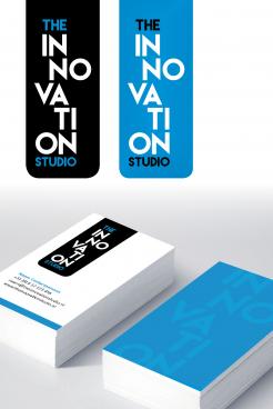
Oh wauw, this looks professional :0
thank you very much for the rating and reaction.
If you like this design in an other colorcombination, please let me know. Or maybe you have some other wishes.
kind regards,
Viola
I was just thinking about this logo and is it possible to align te letters more...like "the" and "studio" starting from the same line...I really like the balance of the colors and font
Thanks again for your comment.
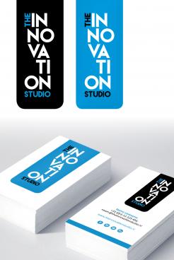
I made the last design in the 'original' blue.
With regards,
Viola
No comments
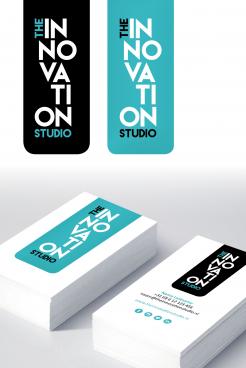
I think I like the the on top...but hrn aligned...with the blue instead of the mint...somehow the mint or vintage blue makes the concept "soft" or less powerfull....
I put 'the' and 'studio' straight under eachother.
I also made an alternative: I changed the locations of the syllables and put 'the' in an other position. Also the color is different.
Wich one do you prefer?
with regards,
Viola
Hello,
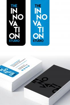
I changed the colors of the last design.
with kind regards,
Viola
I like this design as well, it's playfull
 Nederland
 België
 France
 Deutschland
 Österreich
 United Kingdom
