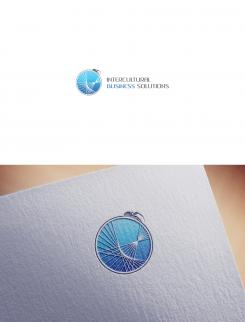
Hello again :)
I did this simple change but I think it looks better already. Suggestion was good.
2ND.
Young intercultural company looking for it's logo
- Contest holder: M.Violin
- Category: Logo design
- Status: Ended
- Files: File 1, File 2, File 3
Start date: 23-06-2015
Ending date: 11-07-2015
It all started with an idea...
A short, interactive guide helped them discover their design style and clearly captured what they needed.
Brandsupply is a platform where creative professionals and businesses collaborate on unique projects and designs.
Clients looking for a new logo or brand identity describe what they need. Designers can then participate in the project via Brandsupply by submitting one or more designs. In the end, the client chooses the design they like best.
Costs vary depending on the type of project — from €169 for a business or project name to €539 for a complete website. The client decides how much they want to pay for the entire project.
Dear 2ND,
Thank you for this new design, we agree with you it looks better and will most likely be the winner except that the resolution is really low and when we enlarge the logo it looks really grainy.
Could you improve on that?
Congratulations again on your high potential design.
Best,
M.
Hello and thank you again.
This is just JPEG (image) with logo on it.
You will get vector at end of contest and vector have unlimited quality If we talk about resolution.
Best regards, 2ND.
https://en.wikipedia.org/wiki/Vector_graphics
No comments
Dear 2ND,
Thank you for your submission.
You have wowed everybody in the office with your elegant yet simple design. It is a serious contender to win the competition.
The concern that has been expressed the most is that the spider looks very intimidating. We realize that this is also what we wanted but maybe the emphasis on the spider can be reduced somewhat.
Our suggestion was to not change anything but how big the letters are. We would like to see exactly the same design and the same layout but with the letters being as big as the sphere ( not as high as the spider ). This will draw the eye away from the creature. Please try to not make the logo too long if possible.
We hope that you are willing to accommodate us in our request and are open to any suggestions comments and questions you may have to improve your design and namely the aggressive nature of the spider.
With kind regards,
M.
Hello.
Thank you for your comment.
I'm glad that you like my work.
I will do the changes.
Best regards,
2ND.
 Nederland
 België
 France
 Deutschland
 Österreich
 United Kingdom

