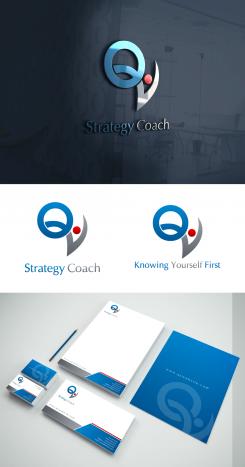
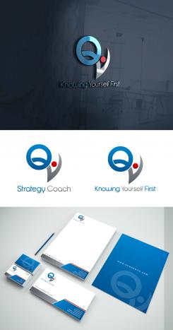
font variation.
Business and Strategy Coach
- Contest holder: Youtoday
- Category: Logo & stationery
- Status: Ended
Start date: 21-10-2015
Ending date: 30-10-2015
It all started with an idea...
A short, interactive guide helped them discover their design style and clearly captured what they needed.
Brandsupply is a platform where creative professionals and businesses collaborate on unique projects and designs.
Clients looking for a new logo or brand identity describe what they need. Designers can then participate in the project via Brandsupply by submitting one or more designs. In the end, the client chooses the design they like best.
Costs vary depending on the type of project — from €169 for a business or project name to €539 for a complete website. The client decides how much they want to pay for the entire project.
Bit modification in logo so Q and V both stands out separately, kindly check this and thank you.
Were content wih the design. I would like to experiment with the fonts from the pay off. Could you make some examples with different fonts which are more business like?
I have post the designs with the font variations on all content, kindly check those posted designs and thank you.
The blue dot (the head) turned into the red color, kindly check it and thank you for the feedback.
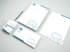
Stationery for new logo design, with 'knowing yourself first'
Thank you! I will respond as soon as possible.
Alright! Thank you for update!
Would you be so kind to change the blue dot (the head) into a red one?
Would you be so kind to change the blue dot (the head) into a red one?
Thank you for feedback, Here is modified design of previous style along with the payoff in 'Knowing Yourself First'. Kindly check this and thank you.
Another style of design, kindly check it and thank you for rating previous posted designs.
Nice. Would you be so kind to change the payoff in 'Knowing Yourself First'.
Where can I find the variation in themes when ik comes to the logo.
And here is the stationery design mock up for logo, kindly check this one as well and thank you.
Yes. Thank you for the designs. I will get back to you as soon as possible.
Revision
The different sleek and modern style of symbol.
Revision
both slogans added into the design.
Hi, kindly check my submission and have your feedback on it, thank you.
The emphasis is on self-development. There is need for a sleek modern logo and corporate identity. The branding will be extended to different webpages and communications. Each training topic or genre has its own color, the different webpages include their own training theme. This means adding an item in the style that must be when necessary adapted or transformed into another color. This creates a line of color linked to a theme. Examples of themes are Motivation, Learning, Potential ...
Would you do the following: Please send a version with the slogan and a version where the word Strategy Coach is replaced by the payoff: Know Yourself First
The logo and its colors will be processed in a website template. Template: http://www.kriesi.at/themedemo/?theme=enfold-overview
And are translated into business card, letterhead and presentation materials.
Hi, thank you for feedback, here are the updated logos with different styles in which both slogan words added under and besides the symbol, and these designs can be adjusted on your web template as well. Kindly check them and thank you.
 Nederland
 België
 France
 Deutschland
 Österreich
 United Kingdom

