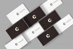
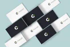
@Cekootje, here is the business card recto verso
Cool logo for independent software developer!
- Contest holder: Cekootje
- Category: Logo & stationery
- Status: Ended
Start date: 07-02-2017
Ending date: 14-02-2017
It all started with an idea...
A short, interactive guide helped them discover their design style and clearly captured what they needed.
Brandsupply is a platform where creative professionals and businesses collaborate on unique projects and designs.
Clients looking for a new logo or brand identity describe what they need. Designers can then participate in the project via Brandsupply by submitting one or more designs. In the end, the client chooses the design they like best.
Costs vary depending on the type of project — from €169 for a business or project name to €539 for a complete website. The client decides how much they want to pay for the entire project.
let me konw your real coordinates and what you want to display on this card.
This looks awesome mate! I don't know it this conversation is private so maybe it's better if I give you the data before we pass the files?
Thanks! this comment section is not private, we will be able to communicate in private on "finalisation mode " once you validate a winner on the site ( i don't know how to do so as i never had a project as a contest holder )
i can edit the info data once in finalisation mode of course
Excellent! I can't choose a winner right now, maybe I have to wait until the contest is over (in four days).
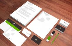
@Cekootje, here are the stationery exemples.
Glad you like it ^^ , it is possible to ask brandsupply to select winner before the deadline ( a previous client did it with me ) but of course it's legit you wait til the end ^^
@Cekootje, here is the business card recto verso
@Cekkootje, is that any better ? (the google logo on my browser contains no grey/brown color so i improvised ^^)
Yep I like it, thanks! So how does this all work? This is the first time I do this through Brandsupply.
I like the logos and colors a lot so I really want this to be my Corporate Identity (do you call it Stationery?) What will I receive when I pick you as a winner?
Thanks!
All you have to do it's to declare me as winner, then i 'll have to upload final logo designs ( two versions ). Once that done, you 'll have to check if the design are ok ( i'll upload 2 illustrator files .ai and 2 .png files for preview and fonts).
I'll be paid by brandsupply once you confirm thoses files.
So I can use your files for example to make businesscards myself? What designs will you send? This one and the one side-by-side? Like the one two below this one?
I'll send 2 files for the logo only ( dark and clear versions ) and i can also send 2 files for business card ( recto/verso )
Can you show examples of the verso? And perhaps an example of how I can incorporate the logos on letters and envelopes?
I don't know if you can see the designs others have sent me, but someone called artmoderne has sent in an example of businesscards recto and verso.
Hello @Cekootje, here is modifications about colors, maybe my screen is really different from yours, hope it will be ok !
I'm sorry but I really don't see any difference with the previous one :( Can't you put a tiiiiny bit of brown in there? Just like the Google logo of today but a littlebit darker.
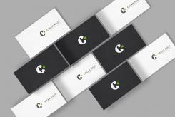
@Cekootje , my bad !^^ here is the grey/brown version with business cards. ( it's grey on my screen )
Maybe it's tricking the eye again but I thought your original designs had a touch of brown in the dark areas. Can you try to make that a little more pronounced?
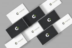
@Cekootje, here is the change of color scheme, i understood that you wanted the color of the business card so i hope it's ok ^^
sorry,you were right about the "C" logo of business card, it was a bit different from previous one ^^ . This one is from the business cards.
Allright! Love the logo, but I wanted the other color scheme :-) I like the brownish color, I just wanted to see how it looks on a businesscard.
Here is an exemple of business cards. ( other inforamtions missing like mail, phone number etc...)
Looks awesome man. The logo on the dark cards is different than on the white cards right? I think the one on the white cards is the best one yet. Can you match the color scheme that's on your other designs?
Looks awesome man. The logo on the dark cards is different than on the white cards right? I think the one on the white cards is the best one yet. Can you match the color scheme that's on your other designs?
Thanks! in this last version ( business card ) the logo on white is exactly the same that the one on dark , may be the contrast is tricking the eye^^ What did you mean about the color scheme ?
Yeah I could be tricked by the eye :-) They are somewhat different than the last logo design right? I like the logo in these cards the best.
What I meant with the color scheme is that the cards (the dark ones) look a littlebit like dark blue. On the other designs you sent it was more like dark brown or something. Is it possible to match that color on the example with the business cards?
@Cekootje, i made another version with the K more visible by pushing C hole to the left as you said.
Is it better like this ?
Hello @Cekootje, here is my design with this modern & classy concept: only font with indentation and reference to development languages ( comment, tags..) let me kwnow if you like the concept , i can make other design based on this concept ( feel free to give me ideas to make better references for programmation codes )
The letter "K" appears inside the letter "C"
Hey Axel, I love this design a lot (also the one with the white background). I'll have to let it sink in for a while but I think it's a strong one. Thanks for your effort so far!
Thanks for your positive feebacks! let me know if you want me to make some variations/modifications.
Can you tell me anything about the green bubble in front of the C? I like it and I know it makes the letter K but is there any more to it? Is it possible to make the K more pronounced? Maybe move the 'hole' of the C a littlebit to the left (I don't know)
By the way this contest was also for the stationery, do you have an example for something like that?
Hello @Cekootje, here is my design with this modern & classy concept: only font with indentation and reference to development languages ( comment, tags..) let me kwnow if you like the concept , i can make other design based on this concept ( feel free to give me ideas to make better references for programmation codes )
Hello @Cekootje, here is my design with this modern & classy concept: only font with indentation and reference to development languages ( comment, tags..) let me kwnow if you like the concept , i can make other design based on this concept ( feel free to give me ideas to make better references for programmation codes )
Hello @Cekootje, here is my design with this modern & classy concept: only font with indentation and reference to development languages ( comment, tags..) let me kwnow if you like the concept , i can make other design based on this concept ( feel free to give me ideas to make better references for programmation codes )
 Nederland
 België
 France
 Deutschland
 Österreich
 United Kingdom
