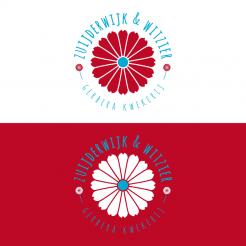
Hi Luke,
attached one more version with a different typefont for the regular text and a variation in positioning the image parts ;), so you have an alternative to the last design. Looking forward to your final decision,
have a nice day & kind regards, Dagmar
Cutflower nursery searching for a new corperate identity and logo
- Contest holder: Luke Zuijderwijk
- Category: Logo & stationery
- Status: Ended
Start date: 08-11-2016
Ending date: 22-11-2016
It all started with an idea...
A short, interactive guide helped them discover their design style and clearly captured what they needed.
Brandsupply is a platform where creative professionals and businesses collaborate on unique projects and designs.
Clients looking for a new logo or brand identity describe what they need. Designers can then participate in the project via Brandsupply by submitting one or more designs. In the end, the client chooses the design they like best.
Costs vary depending on the type of project — from €169 for a business or project name to €539 for a complete website. The client decides how much they want to pay for the entire project.
Hi Luke,
thank you for the good rating ;) Attached a first layout for an according housestyle. If you should prefer a different typefont for the layout, just let me know, so I can show you variations,
best regards, Dagmar
Hi Dagmar,
We will take this design to our final decision.
Hello Luke,
did you mean it like this?
Kind regards, Dagmar
Hi Dagmar,
Yes, this is what i meant. Would it be possible for you to also design a corperate design for the company?
No comments
Hi Dagmar, I likede the old design of the logo beter. Is it possible to use the colourfull flower (5 designs ago) in the center of the logo and for the 2 little flowers between the letters around the red white blue striped flowers (red on top, white in the middle and blue on in the bottom) like 4 designs ago. Only for this design i would like to have the white stripe in the middle to only be 3 leaves.
Would this be possible?
Hi Luke,
attached two versions with the color combination red/white/blue. Hope you like it ;)
Kind regards, Dagmar
Hi Dagmar, would it be possible for you to put the old colourfull flower in the center of the logo and keep this little flowers on the site. For this colours, could you make one more leave down (the long one) red on both sides and one more leave more blue up (the long one) both sides? Looking forward for the design.
Hello Luke,
attached a new variation with some adjustements,
kind regards, Dagmar
Hi Dagmar,
Could you maybe design this one in the colours of the dutch flag? So Red, White and Blue from top to bottem?
I'm not sure if this would look nice, but would like to give it a try.
Hi Luke,
sure I can change the colors for you, but white on white won't work ;) so do you have any suggestion what color to use for the background or which color I should use instead of the white?
Hi Dagmar,
Would it be possible if you would change the surrounding of the leaves from white to black?
Hello Luke,
thank you for your feedback. Attached a first revision with a different coloring and a modified center of the flower.
Kind regards, Dagmar Lange
Hi Dagmar,
I still like the idea, but I still miss something in it. Maybe in this case it's a bit to much colour and are we looking for something inbetween. I don't really know what it is. I also think i liked the old center of the flower better and thought the little flowers on the site where a nice touch. I'm sorry I can't really give you good input right now, but I hope you can do something with it.
No comments
Beste,
Ik vind het idee erg leuk. Zeker de vormgeving van de blaadjes is erg mooi. Ook de naam er omheen vind ik er goed uitzien. De kleuren ben ik alleen nog niet van overtuigd, zou jij hier misschien nog wat anders mee kunnen proberen? Ook zou misschien de aansluiting van het blad op het hart van de bloem anders kunnen. Ik weet alleen niet precies hoe...
 Nederland
 België
 France
 Deutschland
 Österreich
 United Kingdom
