No comments
Design a new logo & CI for “Dukes of Data
- Contest holder: DoD´s
- Category: Logo & stationery
- Status: Ended
Start date: 30-07-2018
Ending date: 15-08-2018
It all started with an idea...
A short, interactive guide helped them discover their design style and clearly captured what they needed.
Brandsupply is a platform where creative professionals and businesses collaborate on unique projects and designs.
Clients looking for a new logo or brand identity describe what they need. Designers can then participate in the project via Brandsupply by submitting one or more designs. In the end, the client chooses the design they like best.
Costs vary depending on the type of project — from €169 for a business or project name to €539 for a complete website. The client decides how much they want to pay for the entire project.
Dear Joe,
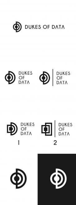
The second logo design preset. If you have any suggestion feel free to write.
Greetings,
Sanja
Hi Sanja,
first of all, thanks for the quick response.
Yes, this gives us a great new view on your logo design. We now see the same logo in squares, which does not impress us so far.
The new positioning of the three words looks gorgeous, thanks for doing with and without the line.
If we do have any further questions to this great stuff, we come back to you.
Feel free to explore something new :D
Cheers
joe
No comments
Hi Joe,
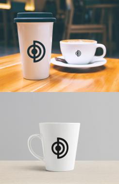
Also present on coffee-cup. Also if you have any suggestion feel free to write.
Greetings,
Sanja
Hi Sanja,
thanks.
As tech-guys we are fueled by coffee. So the big cup is great :)
No further suggestions so far.
Cheers
joe
PS: I put a three star rating on this so when we filter the ratings, we also may see other entries and not only yours :)
Thanks for your understanding.
Hi Joe,
Thank you for comment, I'm glad you like how design looks on cup and t-shirt. :)
Greetings,
Sanja
No comments
Hi Joe,
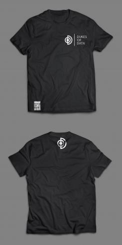
I wont to present logo design how look on t-shirt Front and back. I worked to be simply but still modern. What you think?
Greetings,
Sanja
Hi Sanja,
thanks a lot for putting this up.
We love it. I do really like the small detail dukes of data patch on the lower end on the front. This even might replace the name on the chest.
But thanks a lot for presenting us the logo in different ways.
Cheers
joe
No comments
Hi Sanja,
thanks for this option.
This one is going back to the symetry of your high-rated proposal. We love it.
Cheers
joe
Hi Joe,
Thank you for a comment. Of course if you have any suggestion feel free to write :)
Greetings,
Sanja
No comments
Dear Joe,
Thank you for your comment, also i worked on something new with design :) what you think?
Greetings,
Sanja
Dear Sanja,
Congratulation. Your work is brilliant, simply amazing. :)
Greetings,
Milla
Hi Sanja,
thanks again.
Tha same feedback as before. Althogh it's great to see a slight change, the original is better :)
Thanks and have a nice weekend
cheers
joe
No comments
Hi Sanja,
thanks for coming up with some new variations.
This change give the logo more depth, a 3rd dimension. But the simpicity of the original one does wow us more :)
But thanks for your work and effort.
We apprechiate this very much.
Cheers
joe
No comments
Dear Joe,
Thank you for comment, i work on suggestion and work on first design to present. with name where three words below. also only logo without name. on the last i work on square and angled. What you think? I'll present second logo design same.
Greetings,
Sanja
Hi Sanja,
thanks also for this one.
Without the dot it's a bit cleaner, the dot give the icon more depth, more gravity.
It is so hard to choose between those two. Both are outstanding so far.
Thanks a lot,
cheers
joe
No comments
Hi Joe,
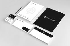
I use mock-up to present how logo design looks in the real environment. If you have any suggestion for design,stationery feel free to write.
Greetings,
Sanja
Hi Sanja,
we had a chat yesterday with the other Duke members and yes, they come up with some suggestions:
In your first entry, you showed us 2 designs, a grey and a black one. Can you show us the grey one in black?
We love your font. Can you show us a version with the three words not in a row but one below the other?
And there was one suggestion to see the grafical element alone without any words. Maybe with some variations (dots, only cercles).
This would be awesome to see! Thanks again for your great effort so far.
Cheers
joe
Hi!
And yes, there was something else - we wonder, what's your idea of coming up with something square and angled.
So if you don't mind... suprise us :D
Thanks
joe
No comments
Hi tennisloool,
thanks for showing us how this design will look like on different papers. It's great stuff.
Cheers
joe
Dear Joe, thank you very much for your comment. If you have any suggestion, feel free to write.
Greetings
No comments
Hi,
this one is diffent - we love to see the first shield emblem. The font is technical and highly visible. The color symbol combination reminds me more of a security company than a data company.
But it's something new. Thanks a lot for that one.
joe
No comments
Dear,
Hope you like design, i work on D+O+D letter to create simply innovative modern logo design. What you think?
Greetings
Hi tennisloool,
this is a great start. We love your font choice (especially the A without the -) and the simplicity.
The black (first) one does have more appeal to us then the gray version. The symbol is some kind of D and O as well as a sunburst diagram.
With this contribution you are on a good way.
Thanks a lot,
joe from Dukes of Data
Dear Joe, thank you very much for your comment. I will work on stationery.
Greetings
 Nederland
 België
 France
 Deutschland
 Österreich
 United Kingdom
