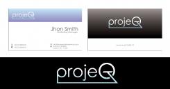
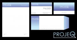
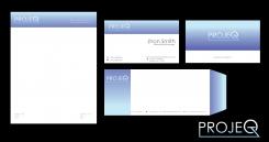
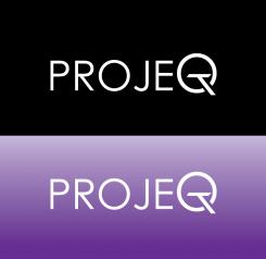
heres the changes thank you for feedback
Design a strong, positive and energetic logo and corporate identity for projeQt, my freelance company
- Contest holder: karin reijnen
- Category: Logo & stationery
- Status: Ended
Start date: 23-01-2018
Ending date: 06-02-2018
It all started with an idea...
A short, interactive guide helped them discover their design style and clearly captured what they needed.
Brandsupply is a platform where creative professionals and businesses collaborate on unique projects and designs.
Clients looking for a new logo or brand identity describe what they need. Designers can then participate in the project via Brandsupply by submitting one or more designs. In the end, the client chooses the design they like best.
Costs vary depending on the type of project — from €169 for a business or project name to €539 for a complete website. The client decides how much they want to pay for the entire project.
thanks! very nice! one last request: can you swap the colors: black & white on the front of the card, purple-blue on the back of the card?
yes i will do that the contest is close now?
hello karin yup i will change this
can you select what the best?
the bottem one after all i think... i like the fact that it turns from purple-blue to ice-blue...
the bottem one after all i think... i like the fact that it turns from purple-blue to ice-blue... can you still adjust the shape of the letter P? the design of logomaker has the shape that i really like.
can you still adjust the shape of the letter P? the design of logomaker has the shape that i really like.
and can you also make the logo with a black/white version where the text turns from white to ice blue? Do you think it is possible to have a business card with those designs in it (one side with purple-blue & ice-bue, one side with black & white)?
design revision #2
with purple shade
thanks. i like the color of revisio #1 better after all.
hello thank you for feedback here's the changes.
design revisio #1
Thanks! These colors i like, it would be nice to have the colors a bit stronger at the bottem (they turn from strong to lightcolored, which I like. However the strong color at the bottom could be a bit stronger). I still did not receive the logo in a seperate design (just the one you designed a week ago which has not exactly the right colors in it). Thanks!
here's the reverse. :)
thanks for feedback
hi! I dont see any changes.... What am I missing? ;)
And can you send the logo (seperare file) with the adjusted colors?
btw, i like the shape of the P better in the design of logomaker, is it possible to change your P more to that shape?
one more request: can you make a watermark in the letter-template? In two days the contest will be finished. For now it will be between you and one other contester, so i hope you can make the suggested changes before then. thanks!!
Yeah sure i will change this thank you for feedback
hello
here's the changes.
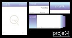
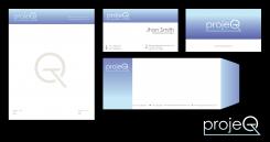
cards and stionery.
I like it!
can you change the logo to the same colors? it dark side of the color can be a bit more strong (so the blue-purple side), it is now a bit soft. thnx!
hello karin
here's my stationery and cards.
if there's anything question to improve. let me know.
best regards
philart
thanks! I dont like the colors and the wave-idea. The blue must be more ice-blue (not turqoise), the purple more bluish. Could you think of another design? Your logo design is in my top 3 so depending on the corp.identity that comes out i will decide who will win. thanks!
e.g. the colors used by designer danusasmita i really like.
ok i will change my stionery thanks for feedbaack
can you also change the colors in the logo to the ones used by danusasmita and logomaker? their colors i really like. thanks!!
hello karin
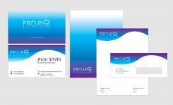
based on your comment here's the changes
best regards
philart
hi can you change the color of these logos? ice blue in stead of turqoise, bluish purple in stead of purple. In the black/white logo it would be nice to let the white change into ice-blue. And the shape of the letter P: i prefer the one in the design of logomaker, could you give the P more that shape? thanks!
can you please adjust the logo according to my feedback above? thnx!
the T letter inside the Q letters
simple and clean logo design.
Thanks, I like it. Can you make the purple less purple and more blue-purple? and can you add ice-blue in the letters (turning from white to ice-blue for example)? Thanks!
oh, and i also like the idea of a connecting line, that connects the T (last letter) to the P (first letter). Could you make an alternative with that connection in it?
Could you also make a corporate identity (huisstijl)? Thnx!
yeah sure no. problem
 Nederland
 België
 France
 Deutschland
 Österreich
 United Kingdom
